Crafting Guidelines for MSPbot’s Asset Team
Project Duration
Q2 2025 | 3 Weeks
Industry
Output Type
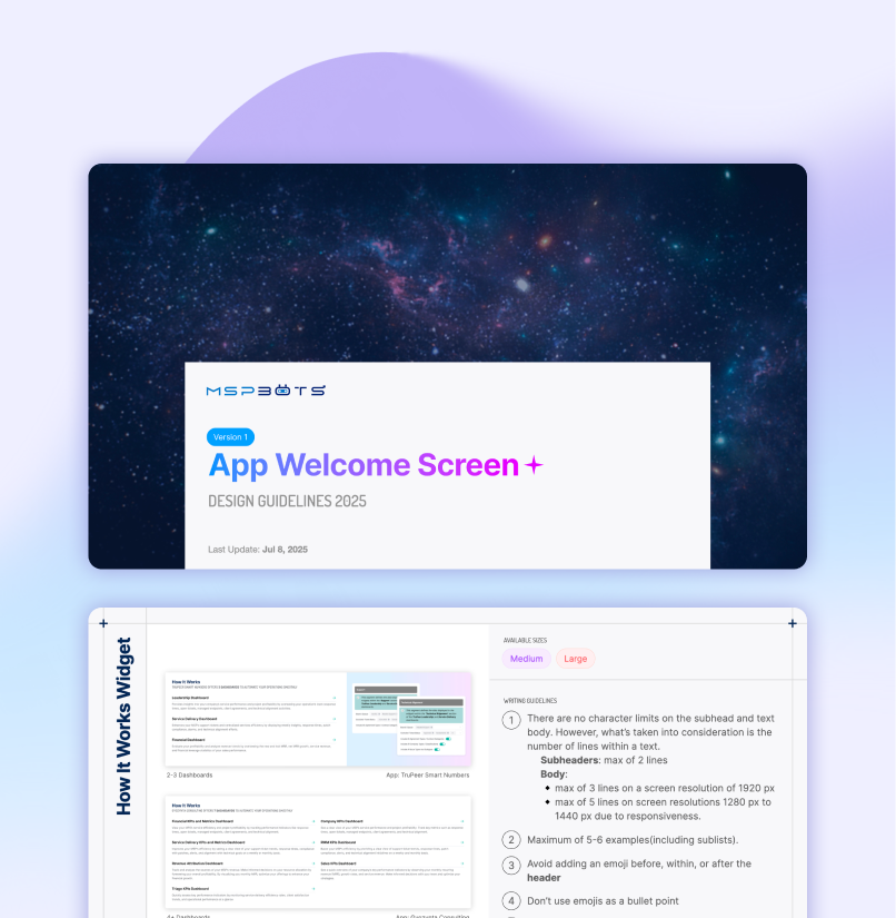
A 3-week internal project where I was requested to create a design guideline PDF for the company’s Asset Team. The guideline revolved around constructing the Welcome Screens of our apps.

Deliverables
PDF Design Guidelines


Context
One of the Asset Team’s main responsibilities are building bespoke client-facing apps that can be utilized for specific use cases. However, due to time constraints, the welcome screen would normally be the last task within their to-do list. With limited knowledge in HTML, the team would rely on ChatGPT to generate code for them, resulting in visually inconsistent sections. This lead to multiple off-brand pages within the company’s product.
King Moya reached out to the Product Head and specifically requested me to create a Welcome Screen Design Guideline PDF because of my hybrid UX/UI and Front-end Development background. The brand guidelines were several years outdated, and the company’s design system only contained basic components at the time.
Team

Me
Glenn Bugtog(Data Analyst)
King Moya(Data Analyst)
Roles
UX/UI Designer
Front-end Developer
Skills
Presentation Design
Page Layout
Copywriting
HTML & CSS
Tools


Research & Discovery
Discovery for this project ran through one primary input: a kickoff conversation with King Moya, conducted over video call. Rather than treat it as a casual hand-off meeting, I used the time to interview him directly about what was going wrong with the existing Welcome Screens and what he needed the new guideline to solve.
Attribute
Detail
Method
Video user interview with King Moya
Location
Remote
Data Type
Qualitative
Stage
Explorative
Purpose
Formative(shaped the new guideline) and summative(evaluated the existing screens)
King also walked me through all the existing Welcome Screens in sequence during that same session. Seeing them together made the problem immediately legible, with inconsistency showing up across:
Fonts
Colors
Layout Structures; and
Information Density
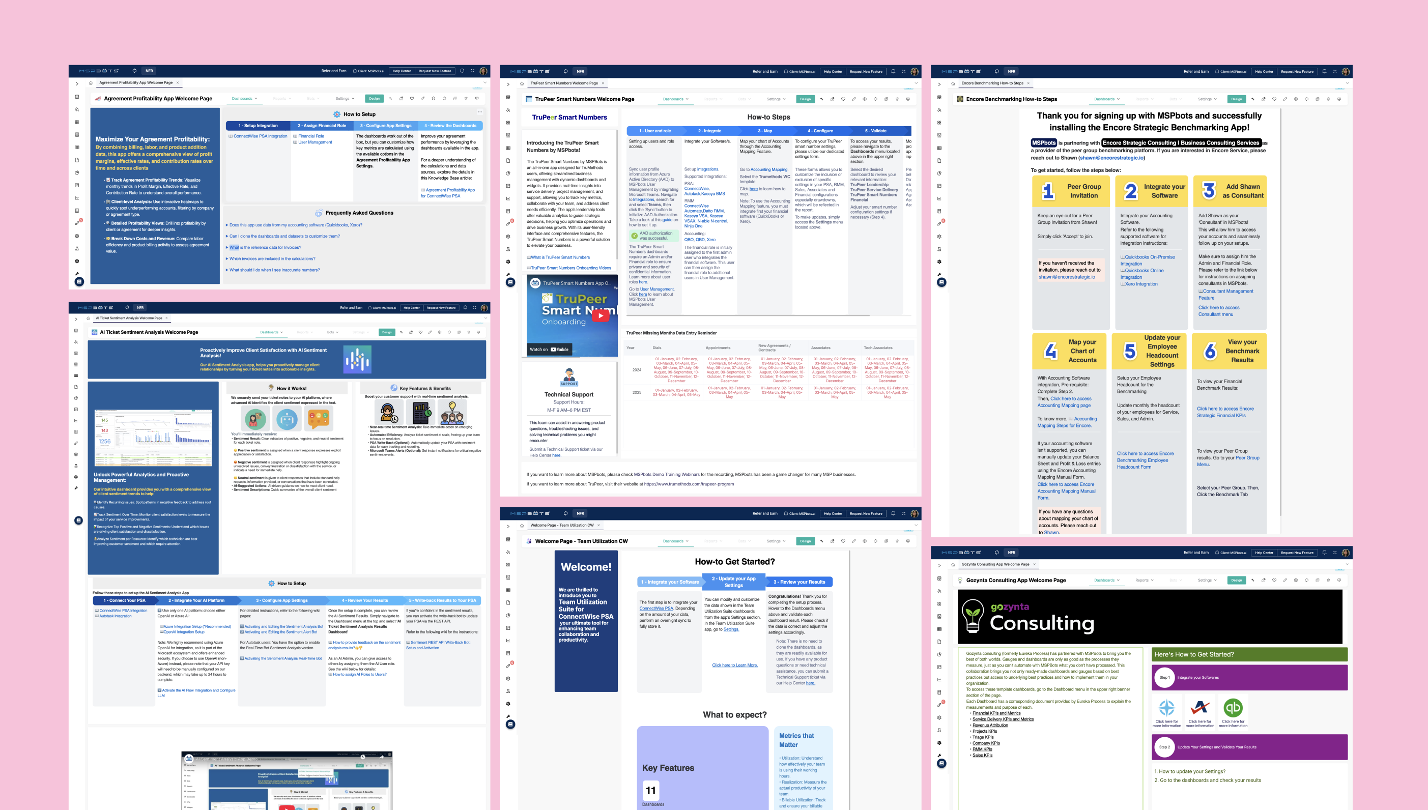
We acknowledged the quality gap openly in the same conversation, and there was no ambiguity about what needed to change.
With no external benchmarks available and no access to a broader user base beyond King, that single interview served as both the research phase and the brief. Content decisions, including which widgets to cover, how to structure layout guidance, and what edge cases to address, were made from what King surfaced directly, combined with my own design judgment. The existing Welcome Screens themselves became the clearest source material of all, since seeing what was already live showed me exactly what not to do.
Key Insights

Adding a Do’s and Don’ts format would remove design ambiguity.
Design Iterations
The first draft leaned heavily on written explanation. My instinct was to document thoroughly and anticipate every edge case in prose. My manager reviewed it and directed me to simplify it.
Web Version of the Design Guidelines
(In-Progress)
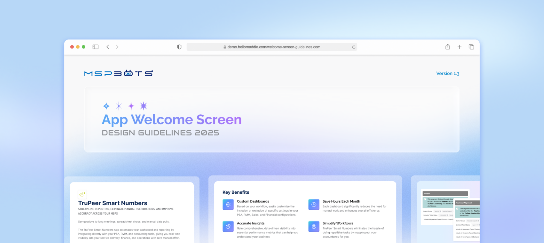
The copy-paste gap in the PDF, combined with a post-departure rebrand that made the original file outdated became the motivation for a self-initiated follow-up: a web-based version of the guidelines built to the branding I co-planned with the Marketing Head before she left.
The web version is currently hosted on GitHub and addresses the one functional gap the PDF couldn't solve: a live, copy-paste HTML that the Asset Team can access directly without opening a document. This project reflects a consistent practice in how I approach portfolio work: I don't just show the plan. I show the thing.

The Results
Impact
Once the Design Guideline PDF and HTML widget templates were done, the efficiency of the Asset Team increased due to clearer design parameters and easier access for custom design requests to me at the time.
Asset Team's Outcome

Glenn adopted the HTML widget templates the same day they were delivered, applying them directly to his active tasks. No additional onboarding or explanation was needed because the templates were built to be copy-paste ready.
Welcome Screens produced were observably more consistent and professional in appearance.
The Product Team Head gave an unsolicited compliment on the quality of the work.
The Asset Team separately requested a follow-up project to create guidelines for the Settings page → a direct signal of trust and continued need.

The custom illustration request process was documented in the guidelines but due to availability constraints and the growing accessibility of AI tools, the team shifted to using generative AI for illustration assets instead. Illustration assets remained as the only area of visual inconsistency post hand-off.
Features
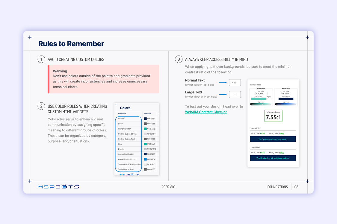
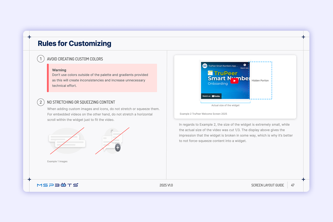
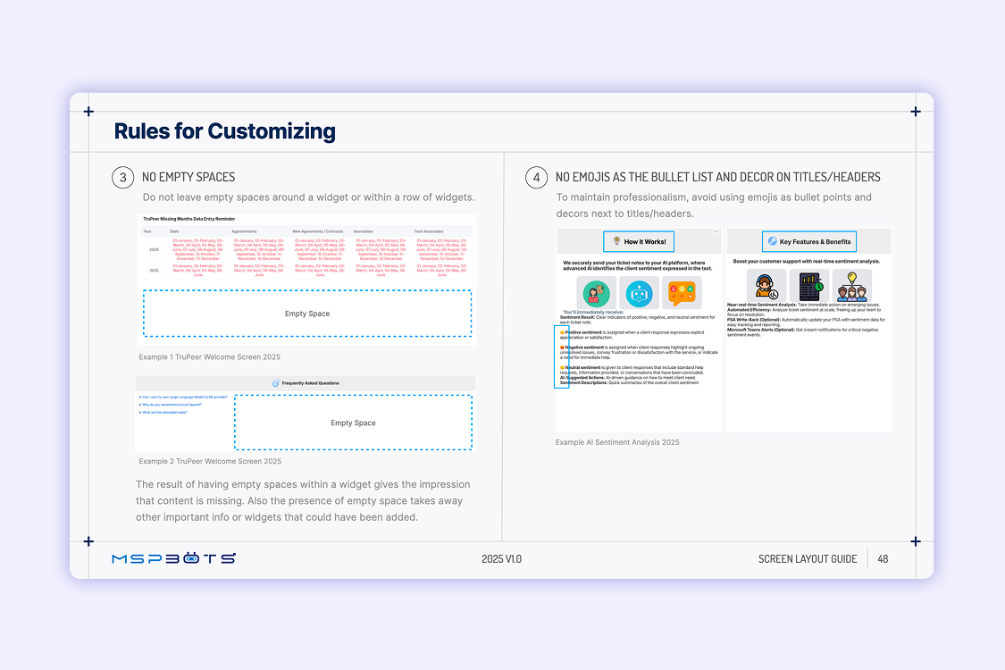
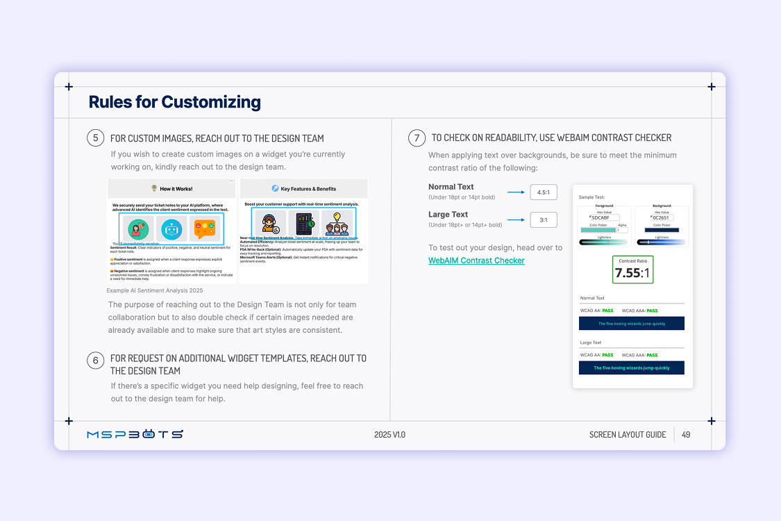
Do's & Don'ts Framework
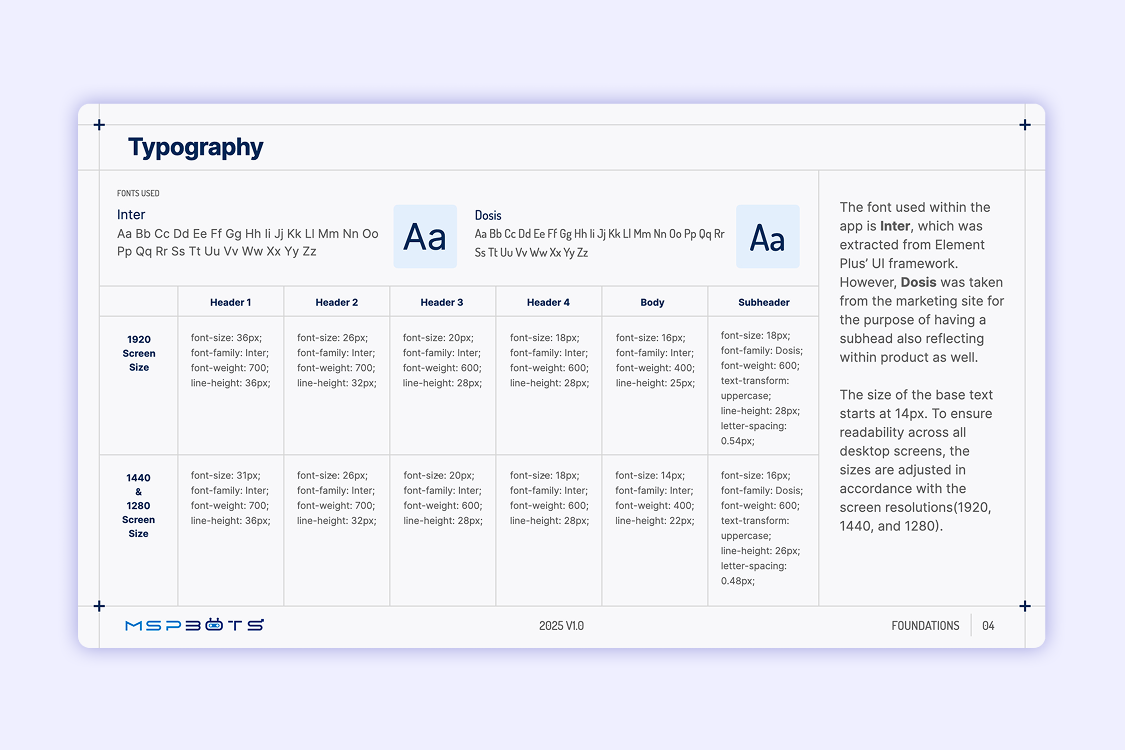
The PDF outlines essential Do’s and Don’ts for foundational understanding and basic customizations. I choose this approach so as to lowers the barrier for non-designers. This format also avoids abstract design principles, and instead focuses on practical applications to their work.
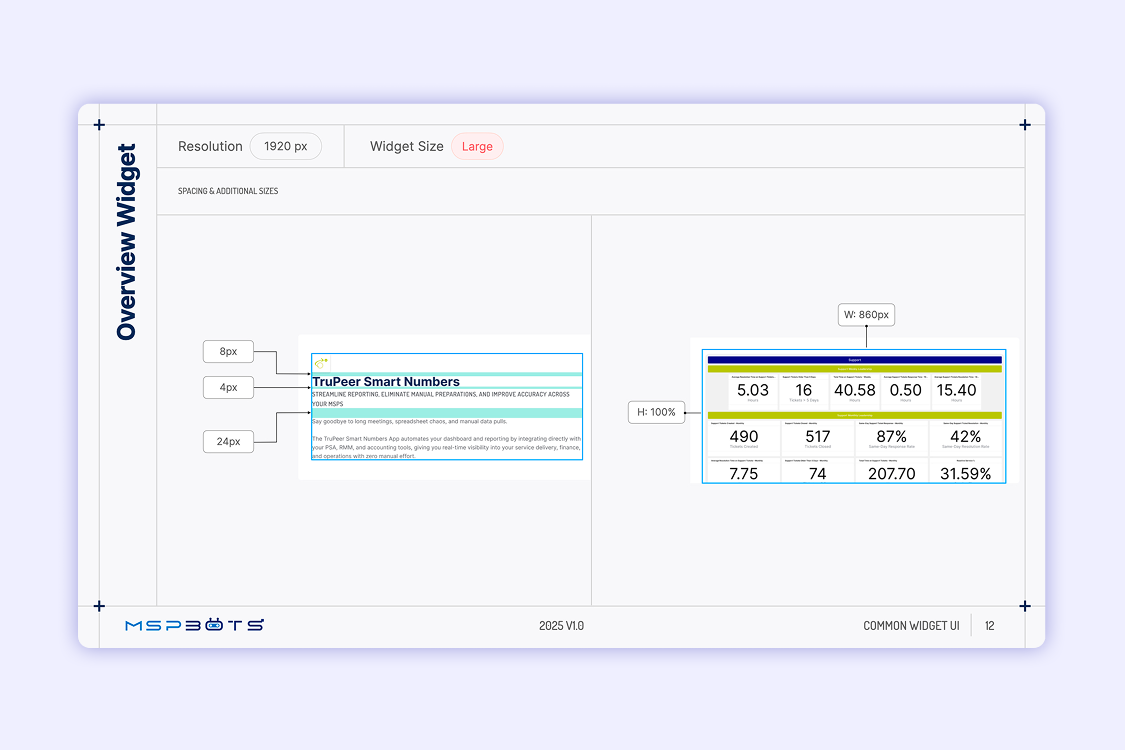
Desktop Breakdown Guidance
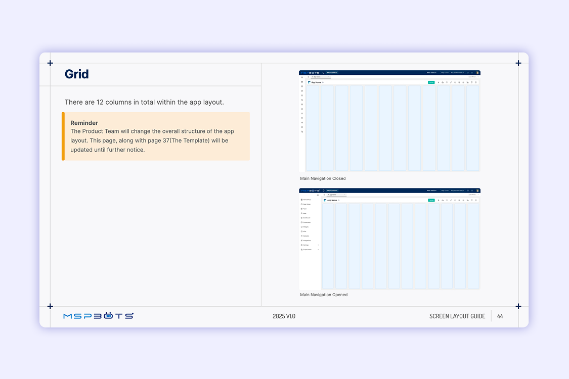
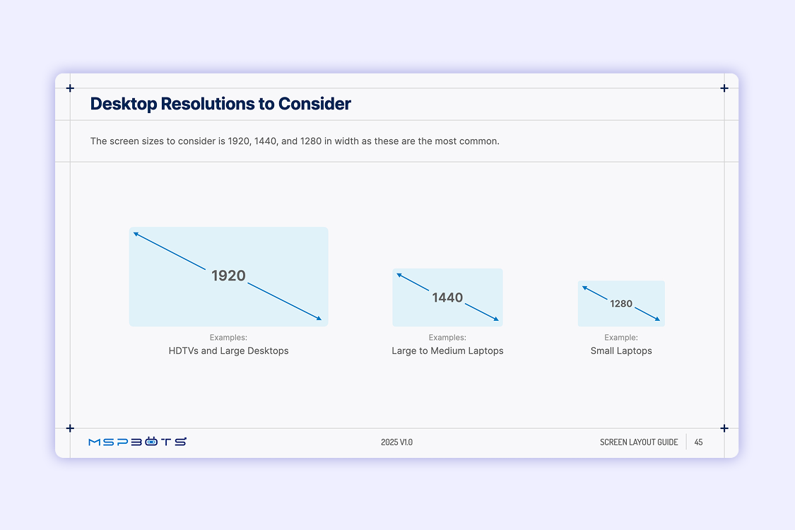
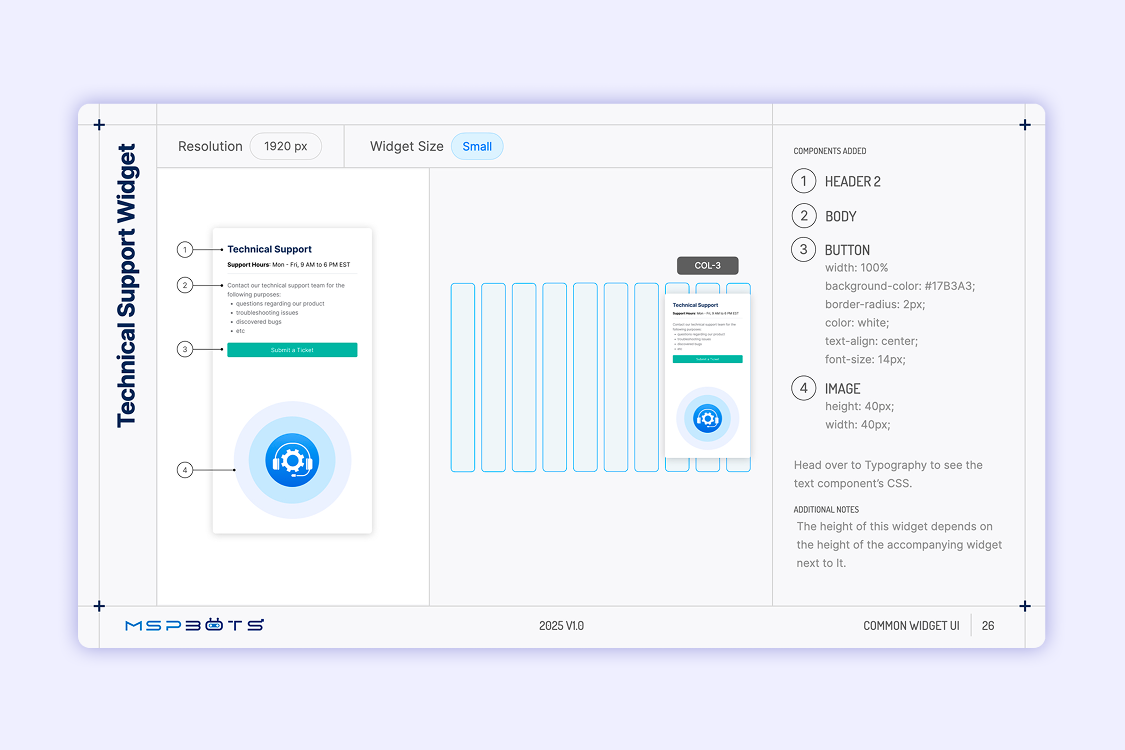
Layout and typographic adjustments were documented for three primary desktop breakpoints: 1920px, 1440px, and 1280px. Mobile and tablet were explicitly out of scope because the legacy product was desktop-only.
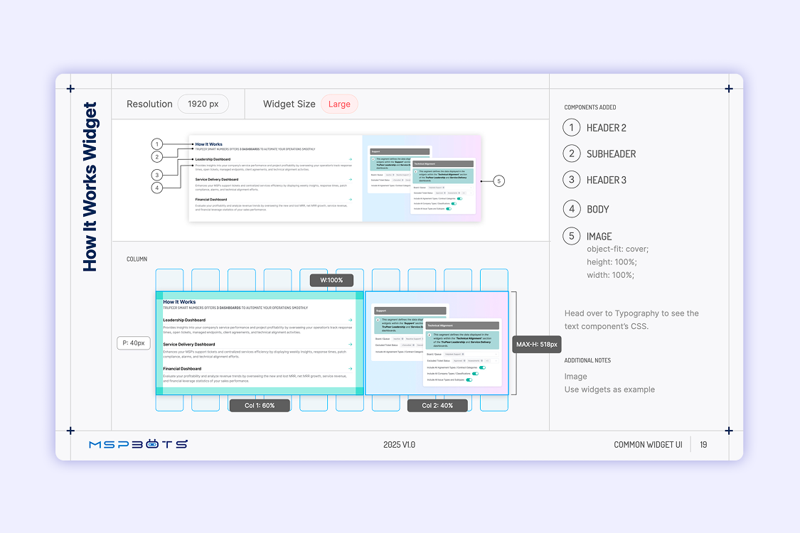
CSS Instructions for Section Widgets
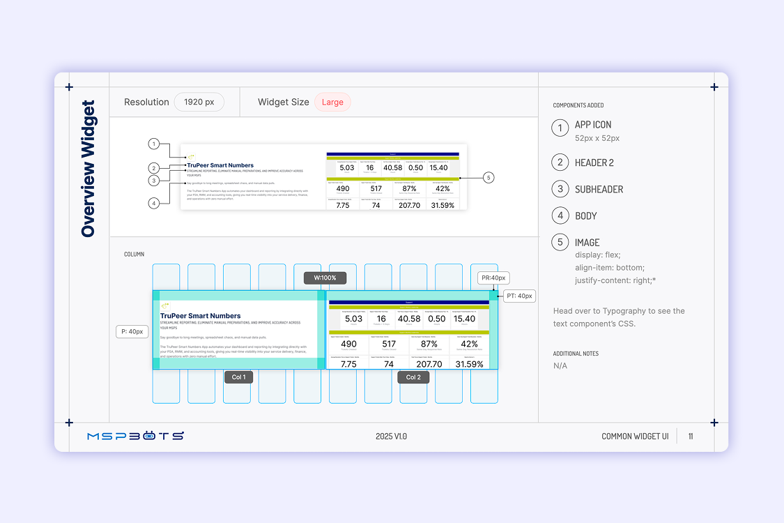
Mid-project, my Manager proposed adding CSS guidance for the section widgets.
HTML Widget Templates
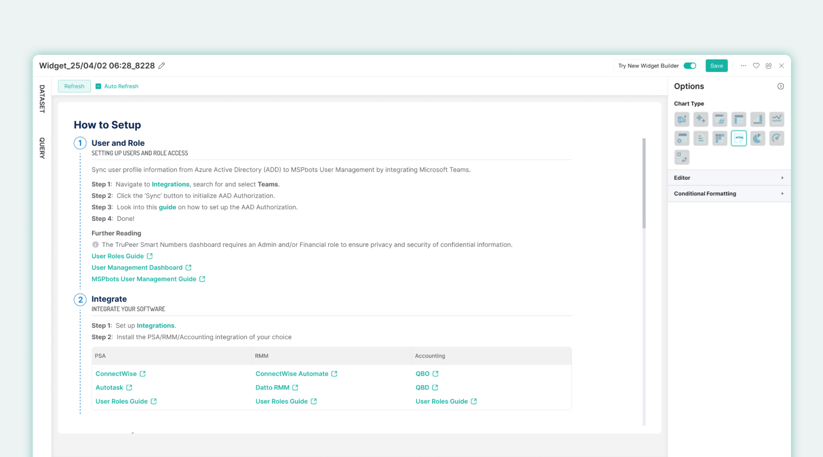
I built the templates directly into the legacy app because I already had a background in front-end web development. This saved us a lot of time because the templates were ready to use right from the get-go. When I handed over the templates to Glenn, he already used it within the same day.
Marketing Site as Visual Bridge
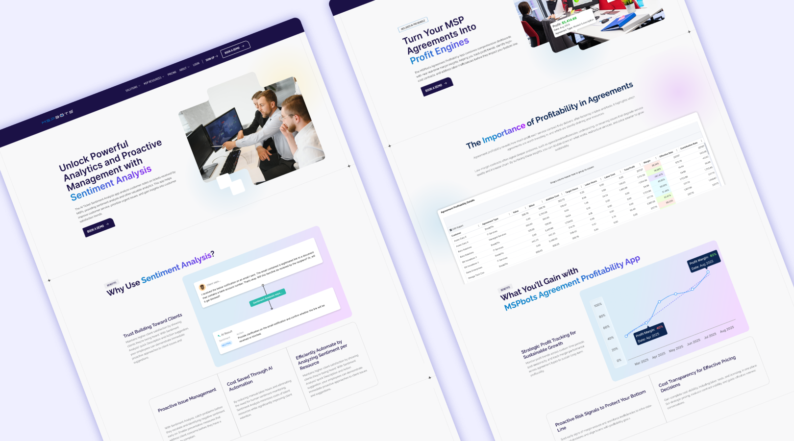
I used the marketing site’s existing visual style as the reference point for the PDF guidelines because there were no updated company-level brand guidelines.
This connected the Welcome Screens to the most publicly visible expression of the brand at the time; creating visual coherence across touch points without requiring a formal brand system to exist first.