Restructuring MSPbot's Design System
Contract Duration
Q1 - Q4 2025
Industry
Output Type
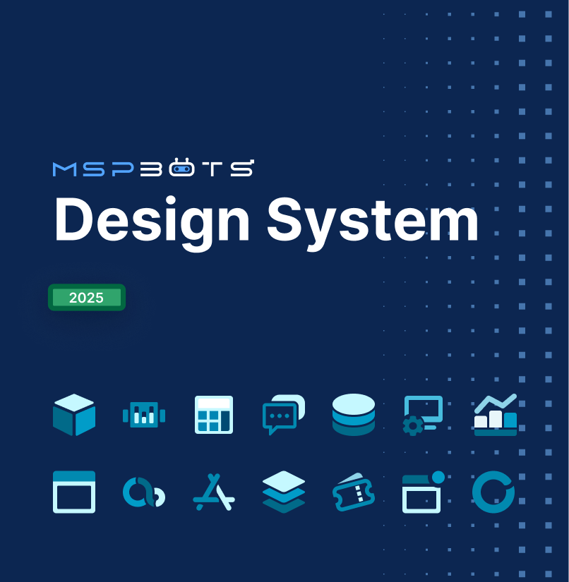
A year-long background project with my colleague, Nora Li, where I’ve documented and aligned all basic components, plus authored an Accessibility Doc and Writing Guidelines doc independently.

Deliverables

Figma Design System File
Accessibility Documentation
Writing Guidelines


Context
MSPbots’ design system at the time was originally rough and had a lot of missing components. Due to this, the library didn’t reflect the existing Legacy Product, forcing designers to spend extra time reconciling mockups against the real interface.
The restructuring project was initiated to fix the following:
- Have a design system that new designers could open and understand independently
- The components matching the actual product; and
- The availability to replace the team's reliance on Element Plus' external documentation site.
The project was also formally scoped into three phases: documentation, enhancement, then UI application, but was consistently treated as a low-priority background task, worked on between higher-priority assignments throughout the year.
Team
Me
Nora Li(UX/UI Designer)
Roles
UX/UI Designer
AI Agent Developer
UX Writer
Skills
UI Auditing
UX Research
Component Designing
Copywriting
Project Management
Tools


Research & Discovery
Discovery happened through these three primary inputs.

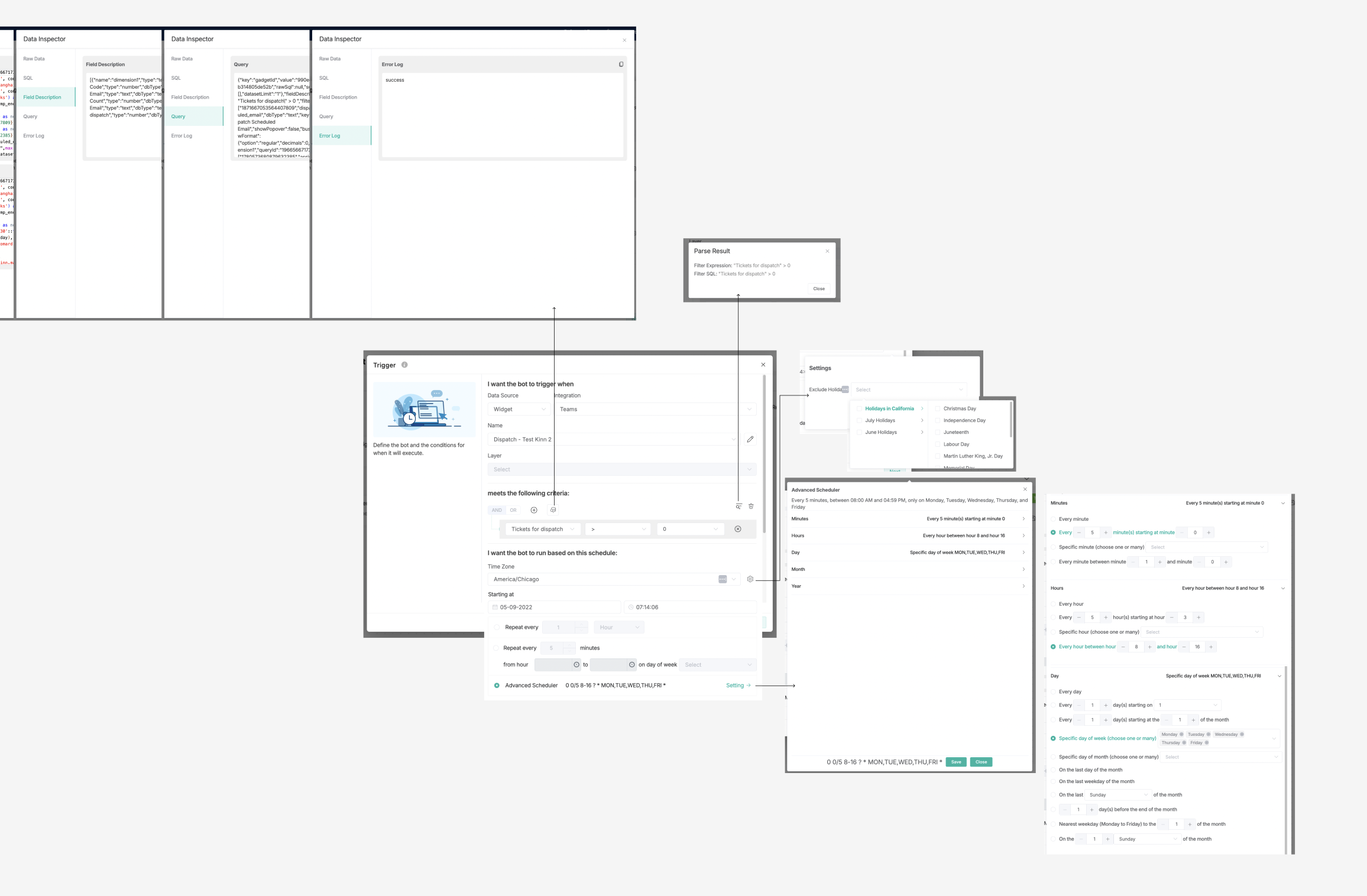
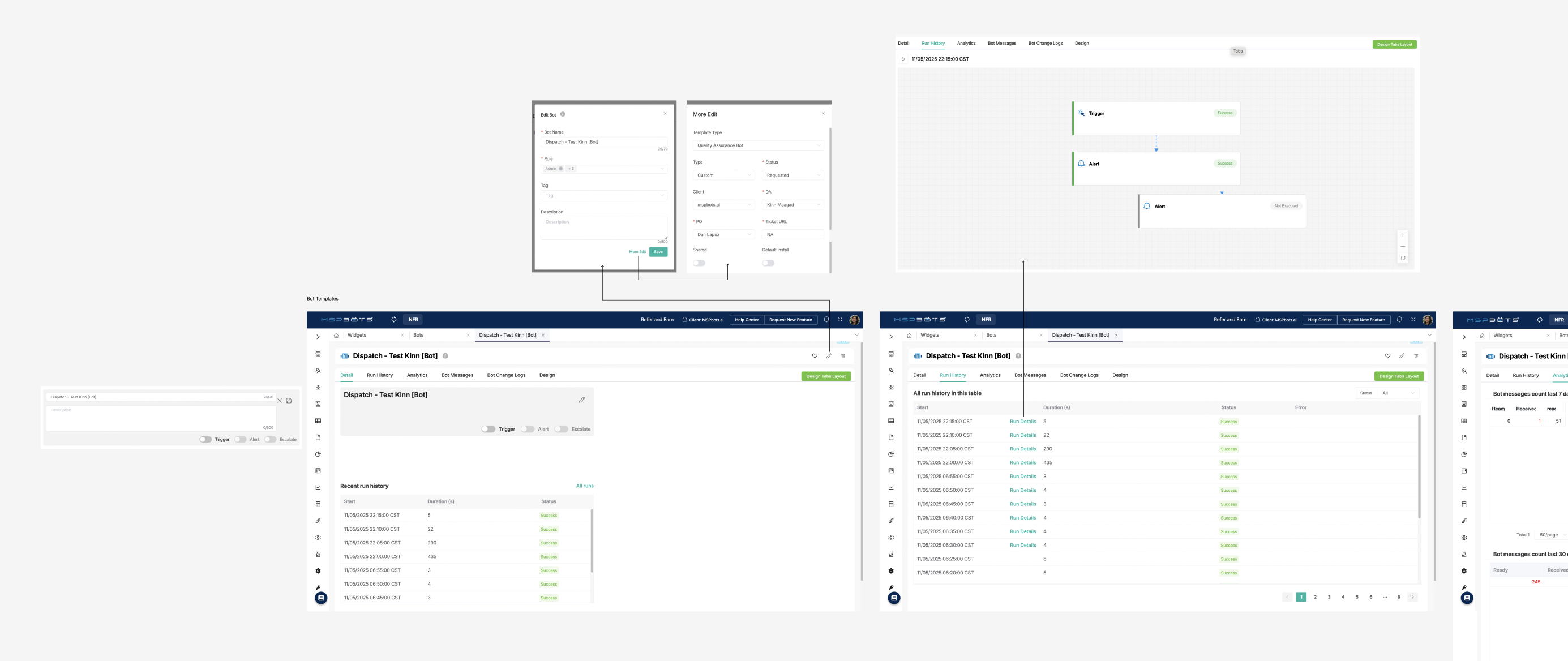
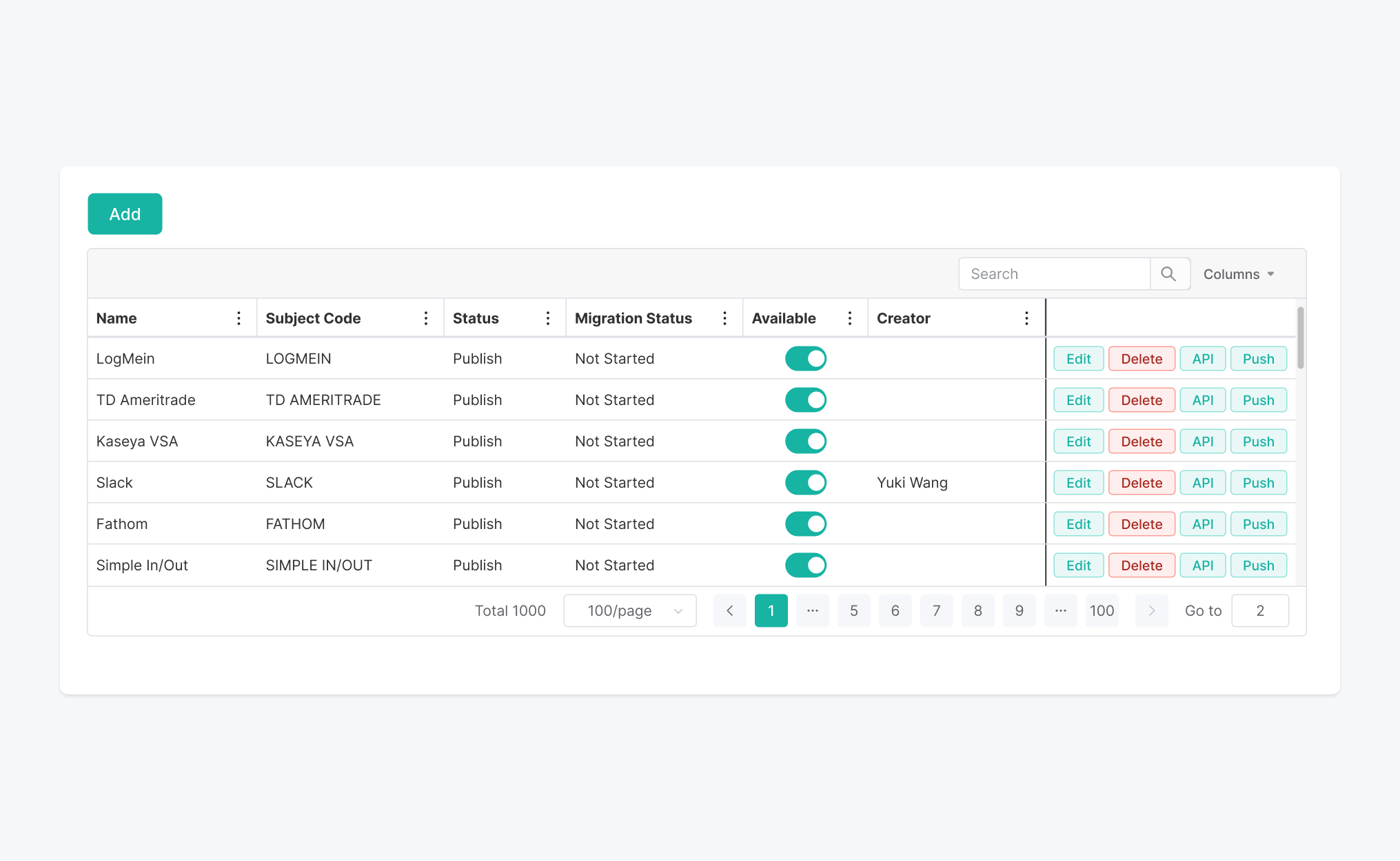
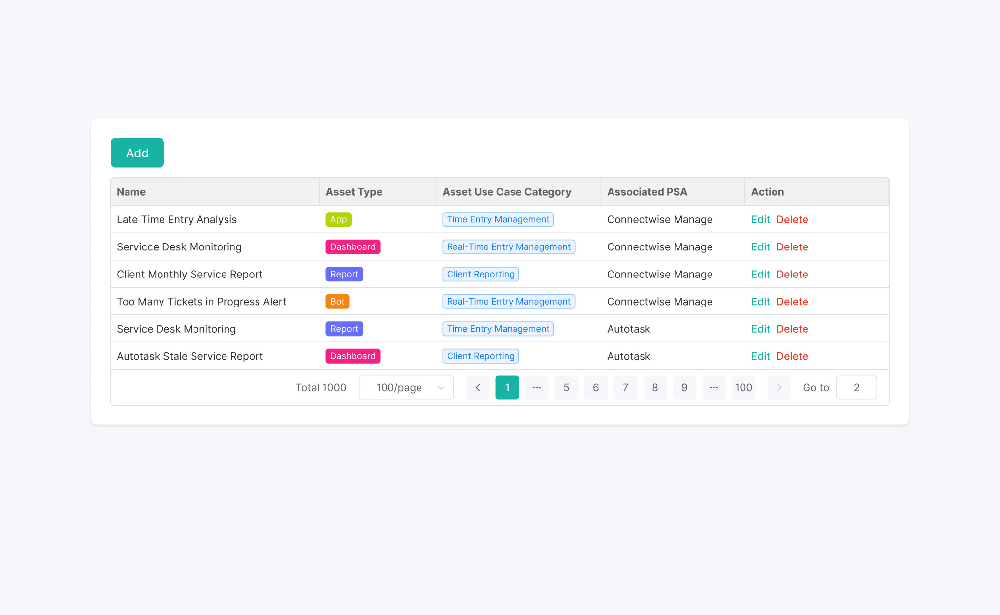
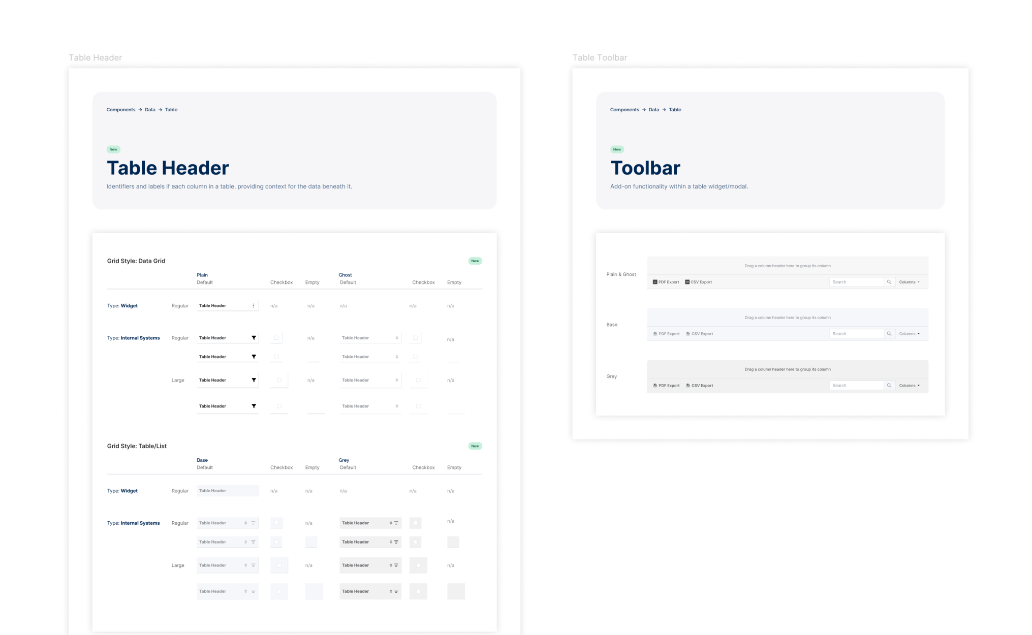
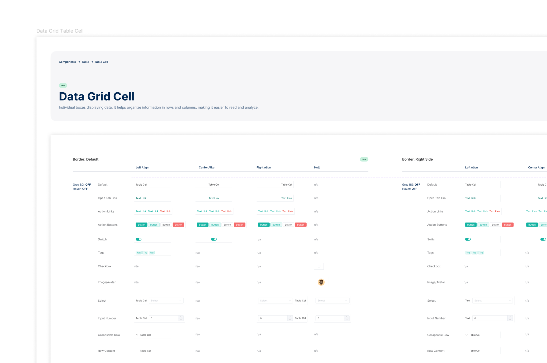
I reviewed the legacy app page by page to identify how components actually appeared in the product(not how they were theoretically defined). This audit surfaced UI inconsistencies, undocumented component states, and the admin vs. client view discrepancies that later required dedicated documentation. The table component was the most complex example: its header varied based on grid style selection and changed entirely between admin and client views.
Key Insights

Always going back to Nora for questions, clarifications, and history-related context on pages and specific components as her foundation work was extremely valuable to the project.
Design Iterations
Early in the project, an Atomic Design structure was proposed: organizing the system into Sub-atoms, Atoms, Molecules, Organisms, and so on. The proposal was reviewed and was actually approved, however over time, the feedbacks afterwards shifted to following Element Plus' existing documentation structure.
The Rationale
Consistency with the external reference the team already used.
The Tradeoff
A structure optimized for Element Plus rather than one that reflected the product's actual component hierarchy.

The Results
Impact
Phase 1 delivered a complete documentation foundation, however the conditions for adoption was shifted faster than the project could land.
The Design System's Outcome

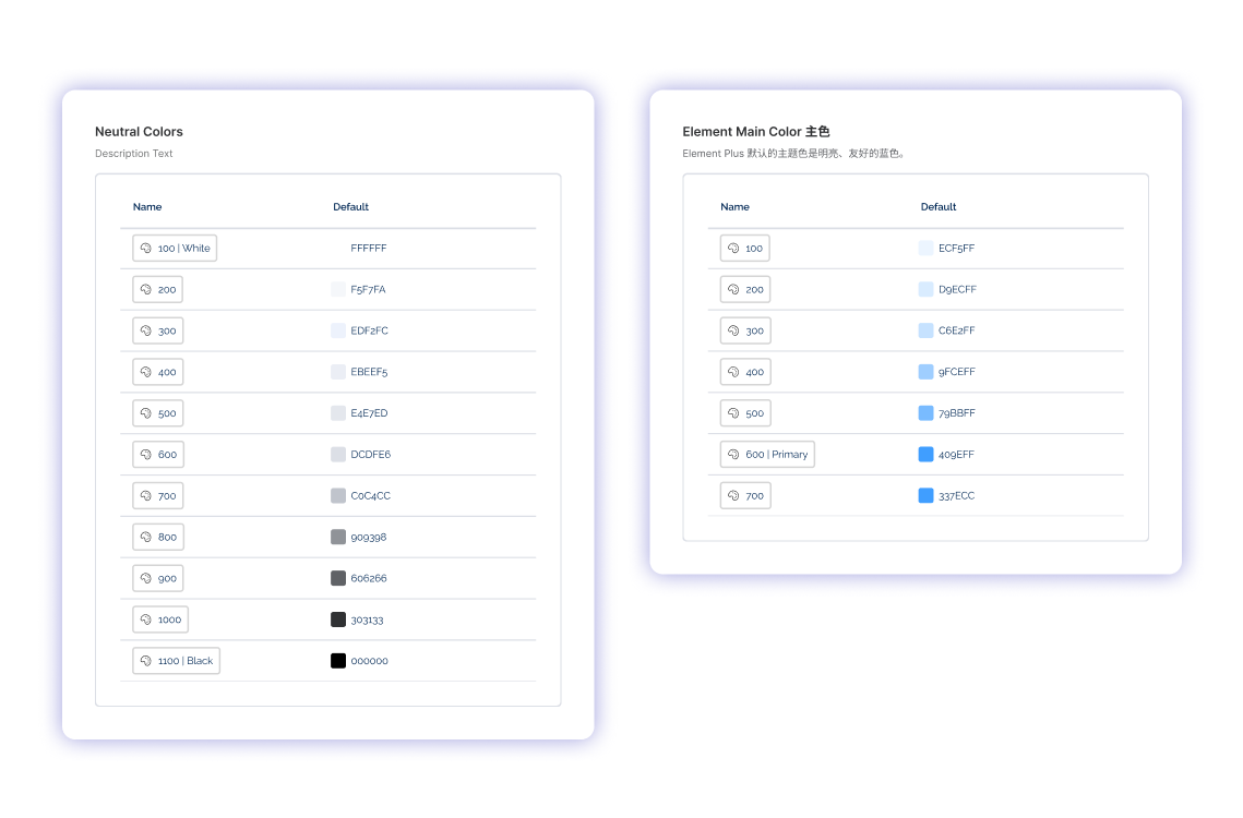
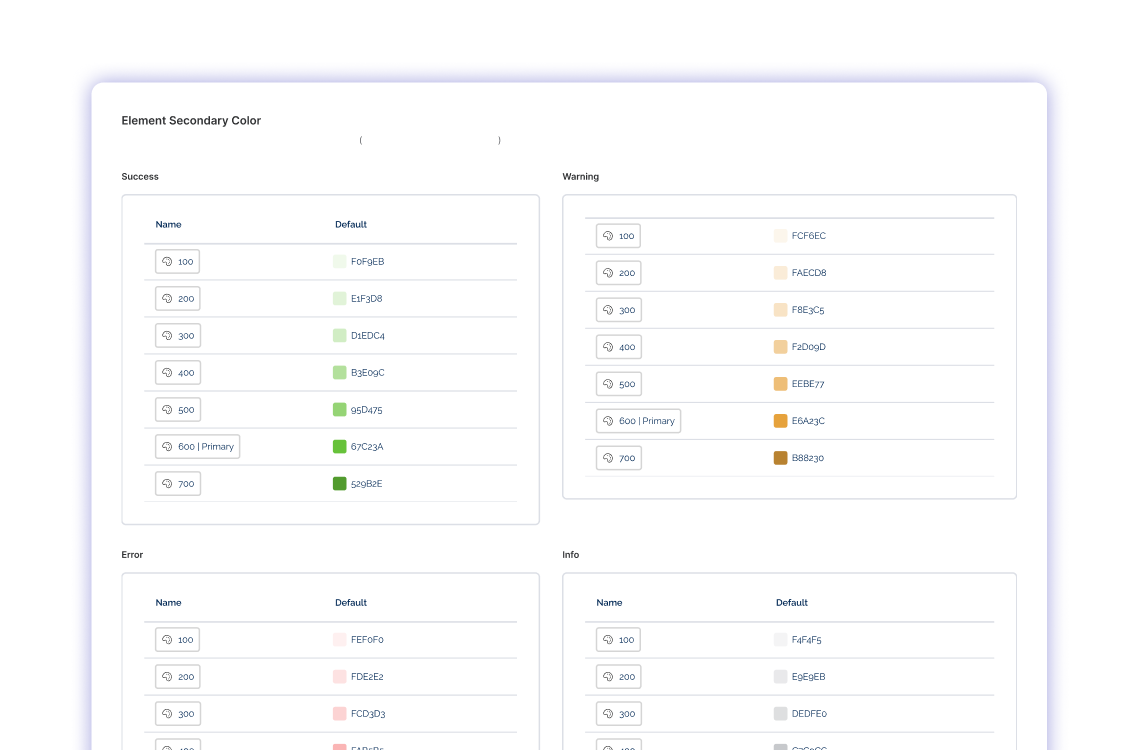
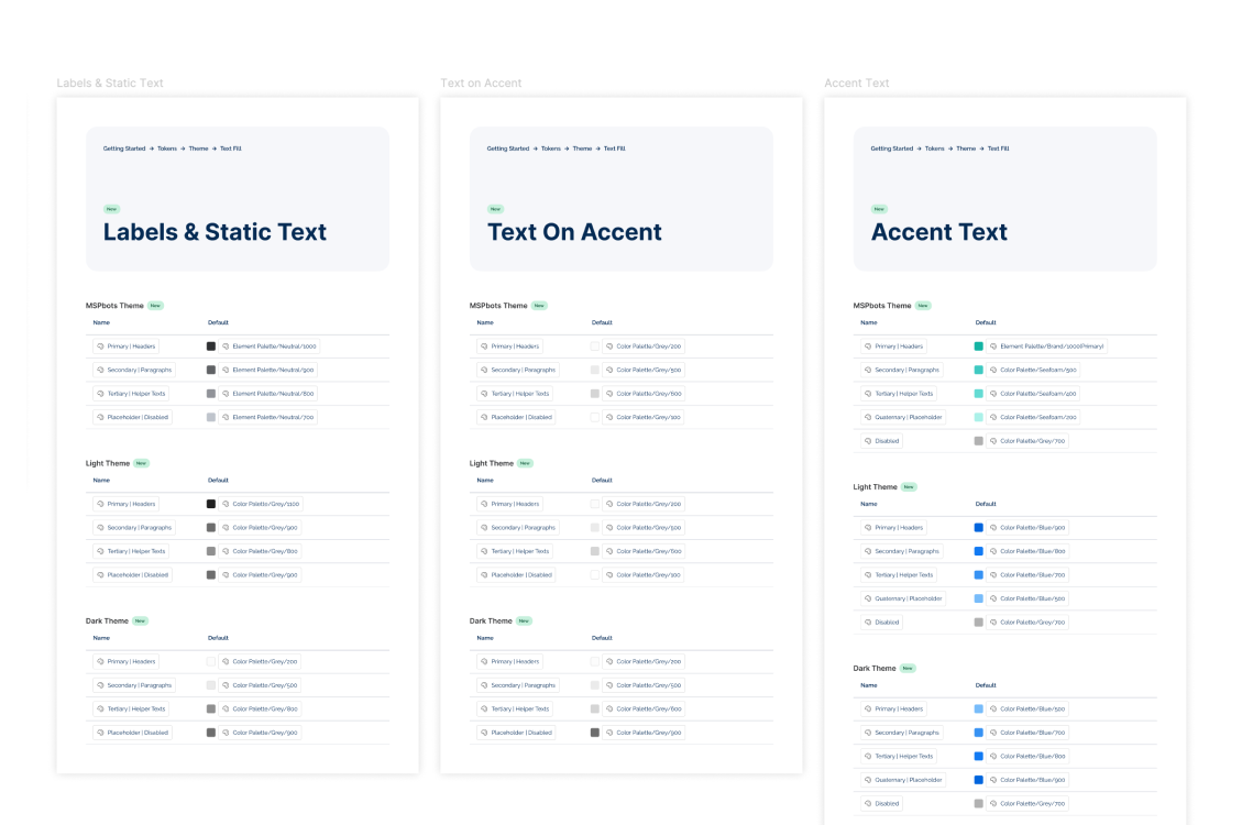
All components were documented by end of year, with variant properties defined and design tokens attached. The Figma file became an internally sourced reference independent of Element Plus' external documentation.
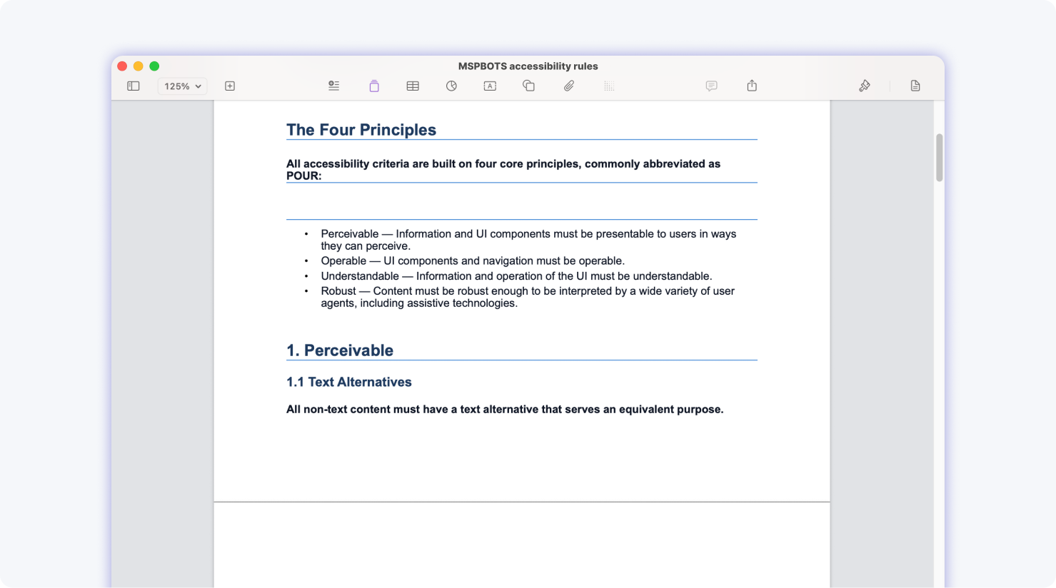
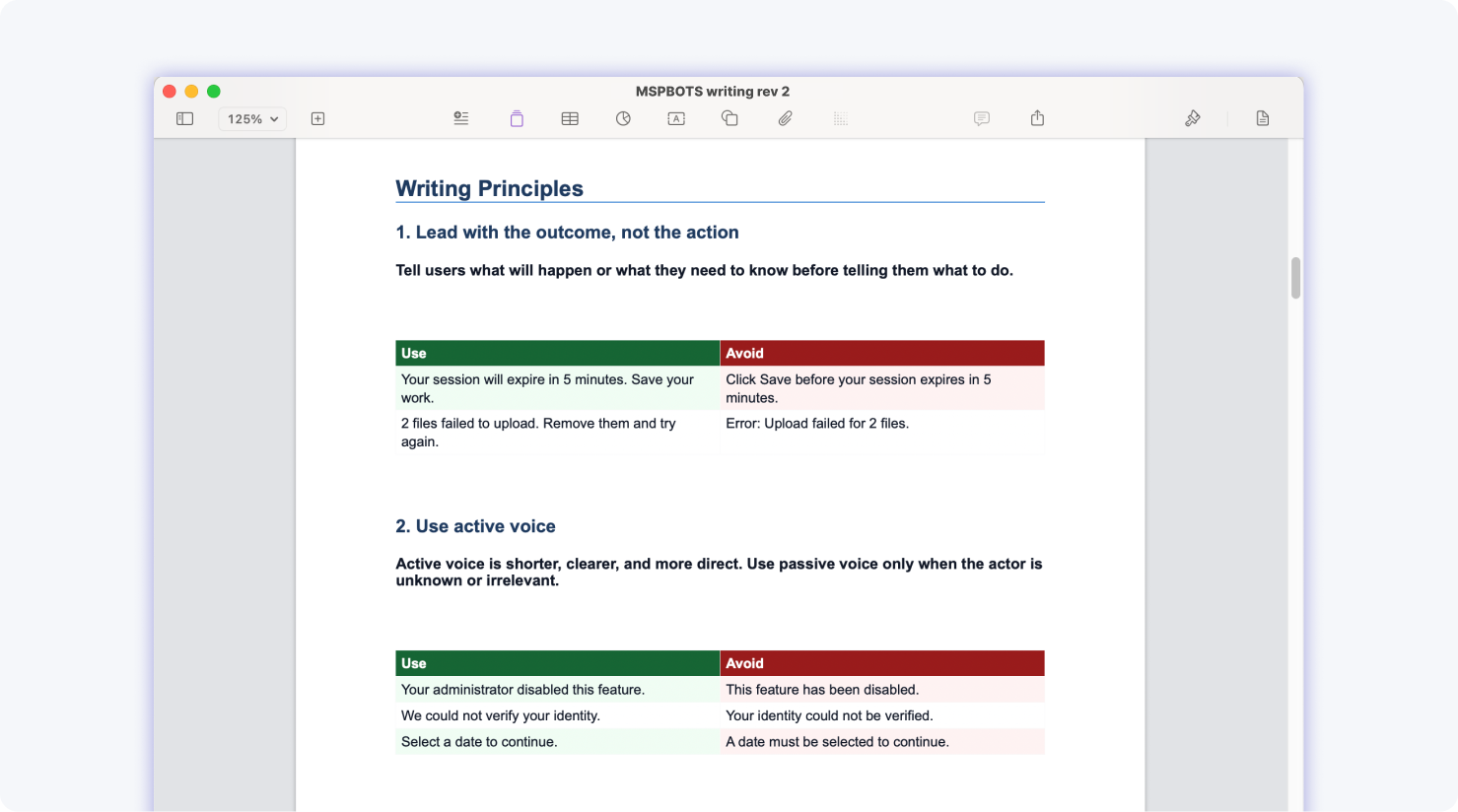
Two additional documentation layers were completed beyond the initial brief. The Accessibility & Writing Guidelines doc were self-initiated based on observed gaps, and they represent the only written standards of their kind for the Legacy Product design system.

By the time the system was complete, the PM and Dev Teams had shifted to using ChatGPT to generate mockups directly. The design system was never fully adopted as the team's primary source of truth. The organizational conditions that would have driven adoption(designer-led mockup workflows and a stable Legacy Product roadmap) had already changed.
The company's strategic pivot towards AI app development made the Legacy Product’s UI enhancement a lower priority. Combined with a mass layoff across multiple departments, Phases 2 and 3 were never initiated. The design system remains a complete Phase 1 artifact with no current continuation plan.
A self-initiated GPT agent that was designed to help team members query the design system and assess mockup feasibility was in progress as part of the company's AI contribution initiative. It was not completed before the layoff. A parallel initiative by Nora was a vibe-coded website version of the design system was finished but got paused due to dev unavailability.
Features
All Component Documentation
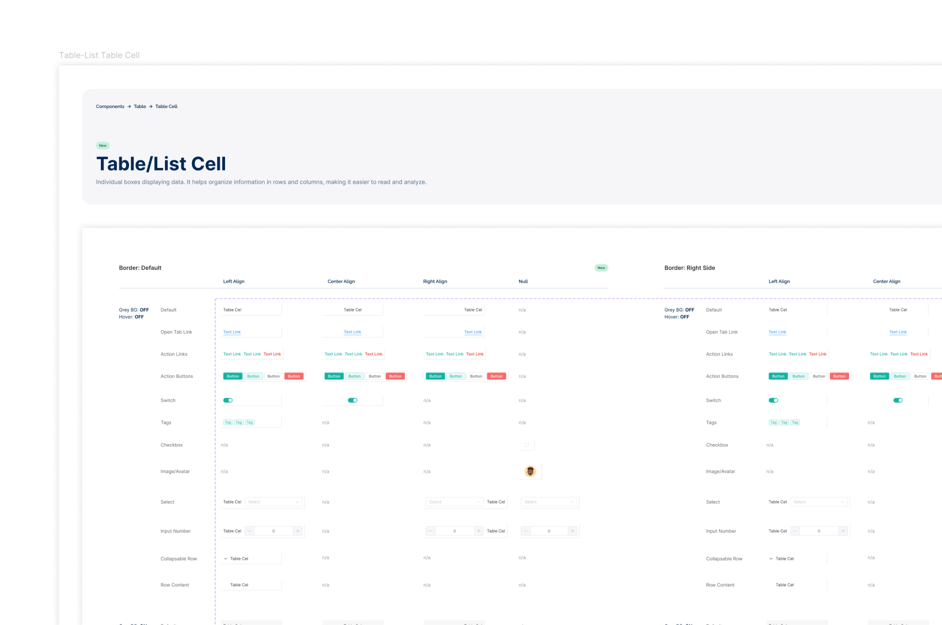
Each basic component was documented with its variant properties, design tokens, and applicable states, building a foundation that matched the actual Legacy Product rather than a theoretical or aspirational component set. Discrepancies between the design system and the real product were identified through page-by-page audit of the Legacy App.
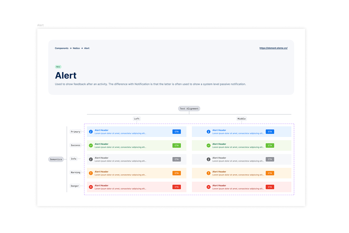
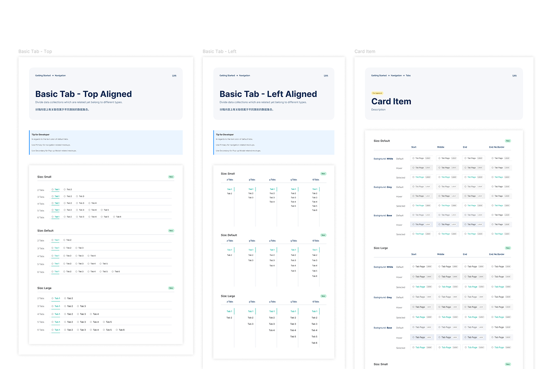
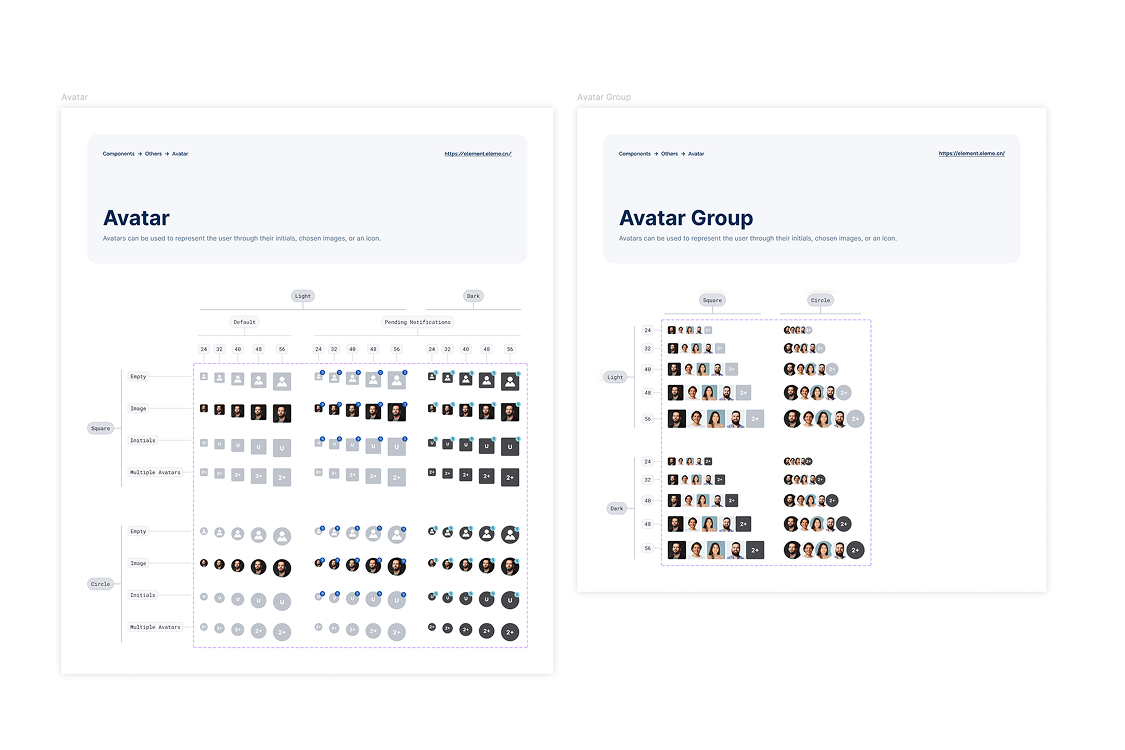
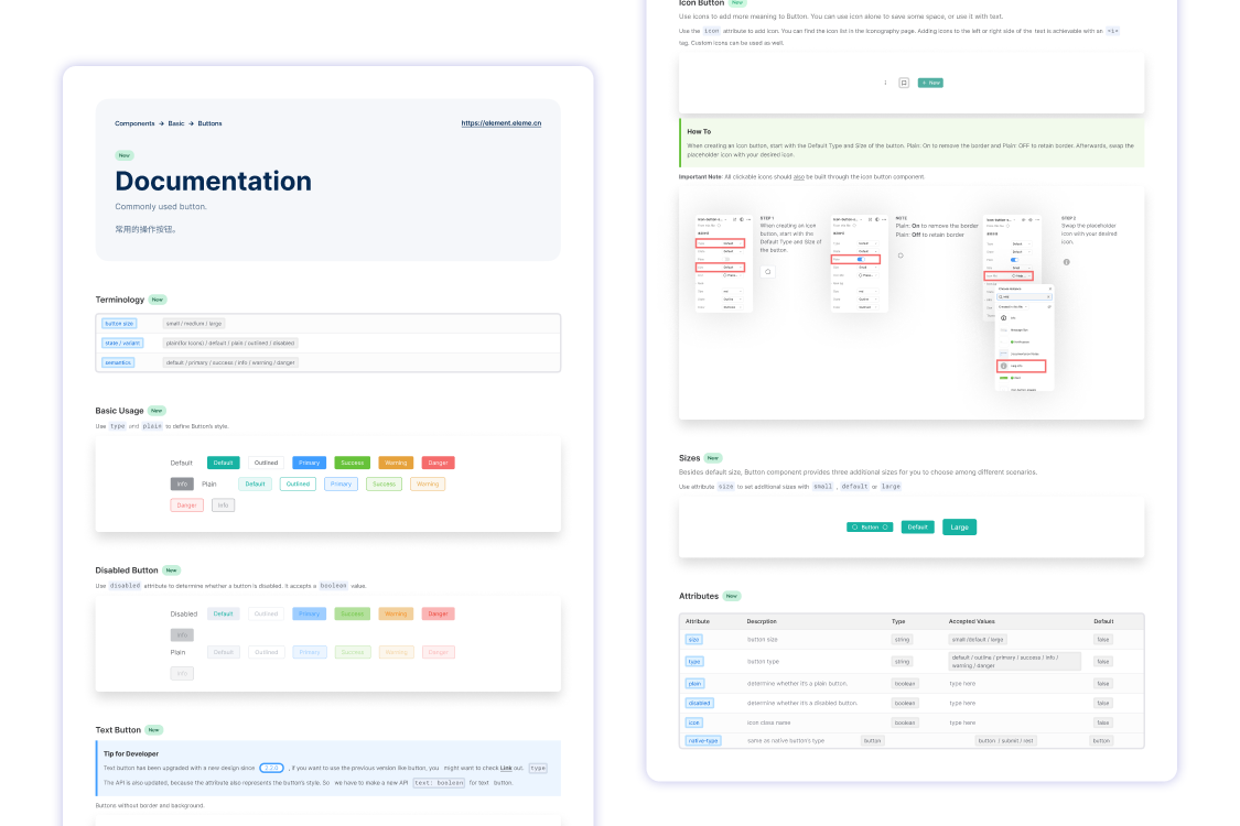
Admin View vs. Client View Differentiation
A late-stage discovery revealed that the table component rendered completely differently depending on whether the user was in admin view or client view. These were not minor style differences, they were substantively different UI states of the same component. The inconsistencies were surfaced, documented, and resolved as a feature enhancement rather than being left as silent gaps in the system.
Accessibility Documentation
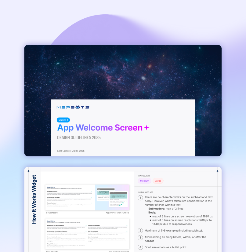
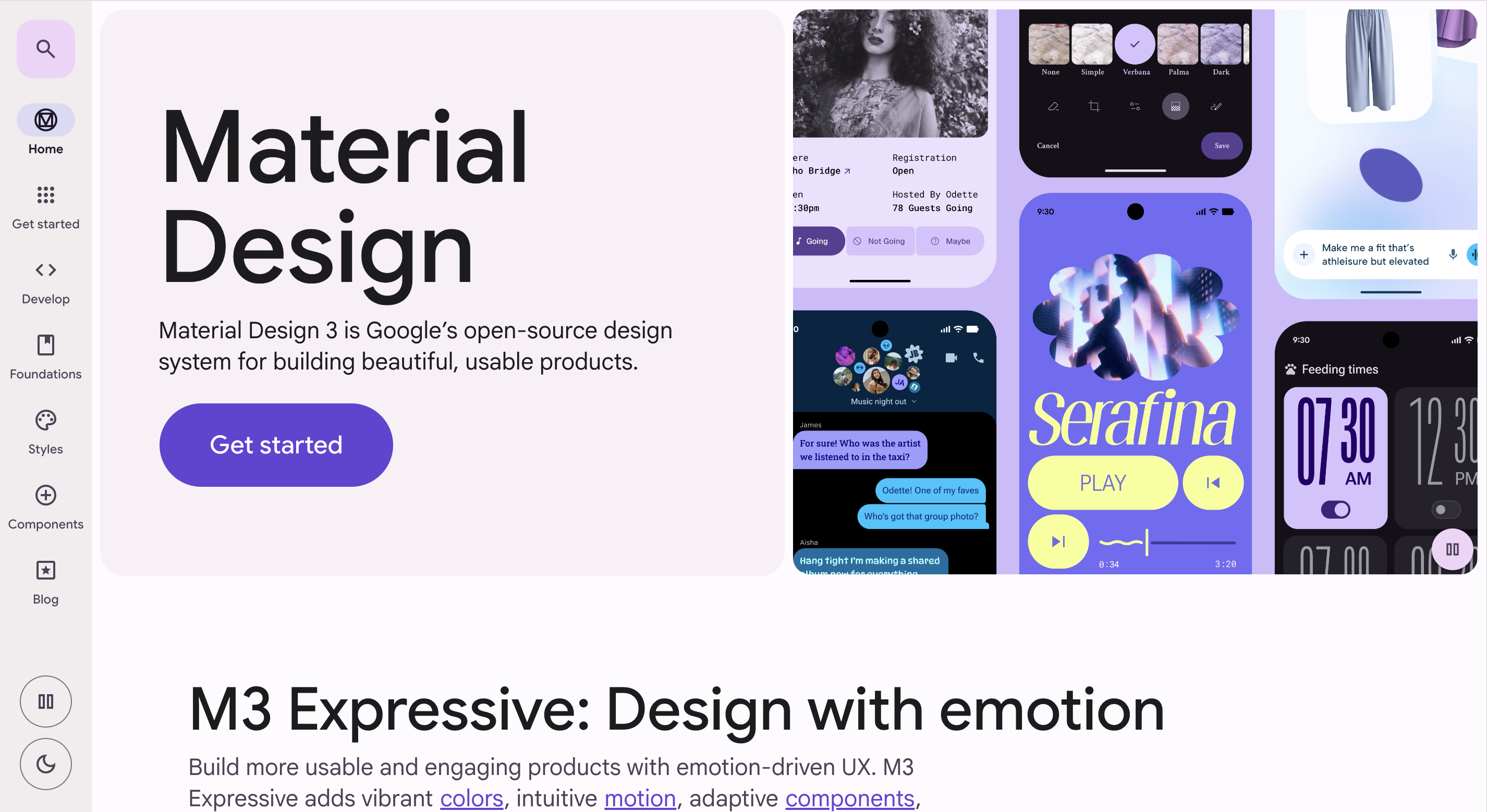
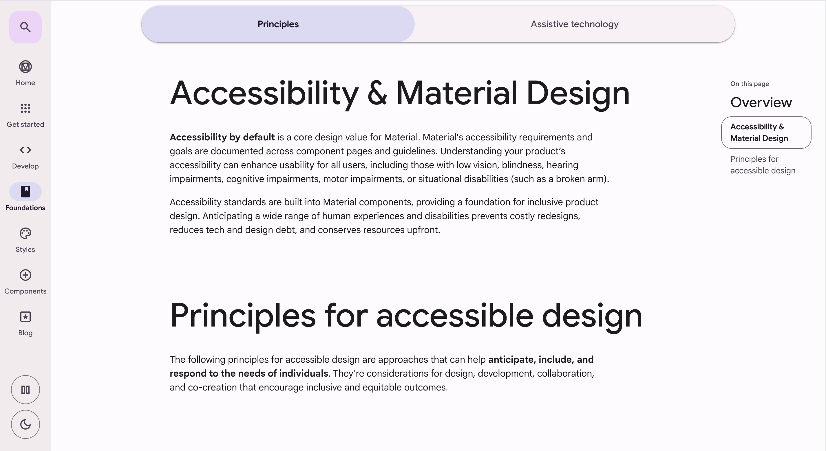
Written standards covering accessibility considerations for the Legacy Product design system. Informed by external design system references and authored independently. Intended as a baseline reference for designers and eventually, developers.
Writing Guidelines
Internal documentation establishing writing standards and tone for the product. Adapted from external references to fit MSPbots.ai's context. Authored independently due to English fluency advantage within the team.
Design Tokens and Element Plus Figma Library Integration
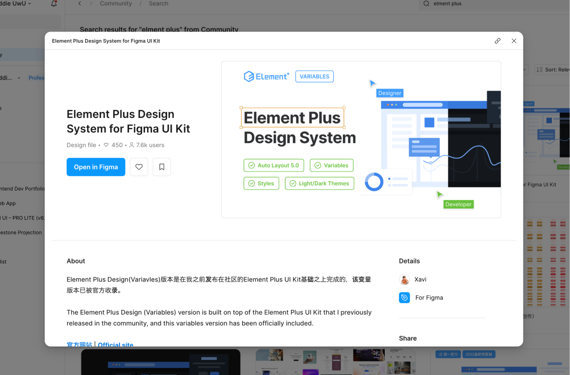
Upon discovering that Element Plus maintained an official Figma library, the workflow shifted: rather than building components from scratch, components were copy-pasted from the library, and variant properties were adjusted to match the Legacy Product. 80% of the remaining Primitive and Token Variants were still fleshed out manually, but time saved was still significant nonetheless.