The Duck Stops Here: Designing Kuushy’s Posture-Coaching App
Contract Duration
7.5 Weeks
Industry
Output Type
A 7.5-week engagement as sole UX/UI Designer for Kuushy, an AI-powered smart cushion that coaches back posture. The brief shifted multiple times as a first-time founder introduced new ideas mid-development, making it the job to translate those ideas into structured, buildable UX while protecting the original scope.

Deliverables

Full Mobile App Design (Figma)
Mascot & Avatar Illustration Set
Animated Exercise Library (After Effects)
Design System (Handover File)


Context
Kuushy is a smart, Bluetooth-enabled cushion designed to improve sitting posture, developed by an independent startup team shortly after their Kickstarter campaign was funded. At the start of the engagement, the product had no finalized branding: the team was still switching between blue and orange as a primary palette, and the logo in use was not the official version. The brief itself continued to shift throughout the project, as the CEO introduced new feature ideas mid-development without always engaging with the UX reasoning behind the flows those ideas required. This made establishing and holding a stable design direction the central challenge of the engagement, more than any single screen or flow.
Team
Me
Ian Lim(Project Manager)
Role
Sole UX/UI Designer
Skills
UX Research
Prototyping & Wireframing
Motion Graphics Animation
Character Design
Vector Illustration
Tools


Research & Discovery
Discovery happened through these inputs.

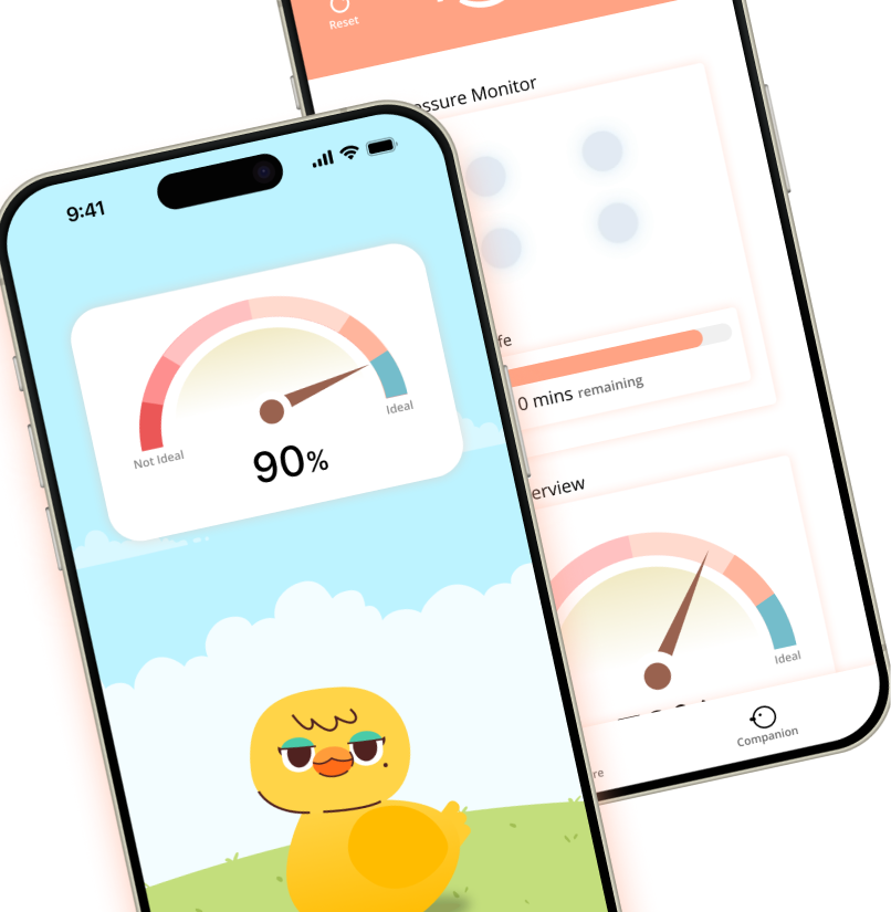
Requesting the cushion’s technical specifications before designing the sensor visualization surfaced how posture data was actually being detected and reported, which shaped a feedback UI grounded in real device behavior rather than a generic loading or status icon.
Key Insights

...decisions had to be re-presented at nearly every check-in. This reinforced the value of locking a creative and product direction before investing in high-fidelity screens.
Design Iterations
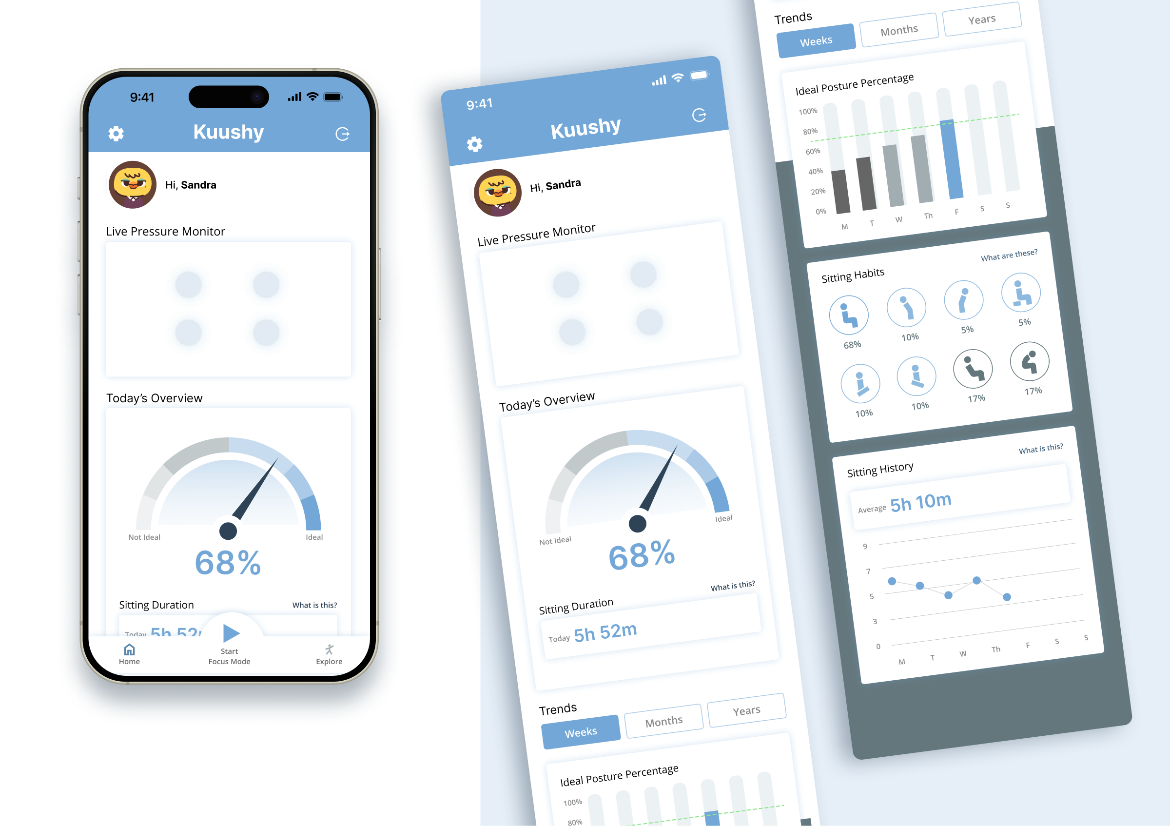
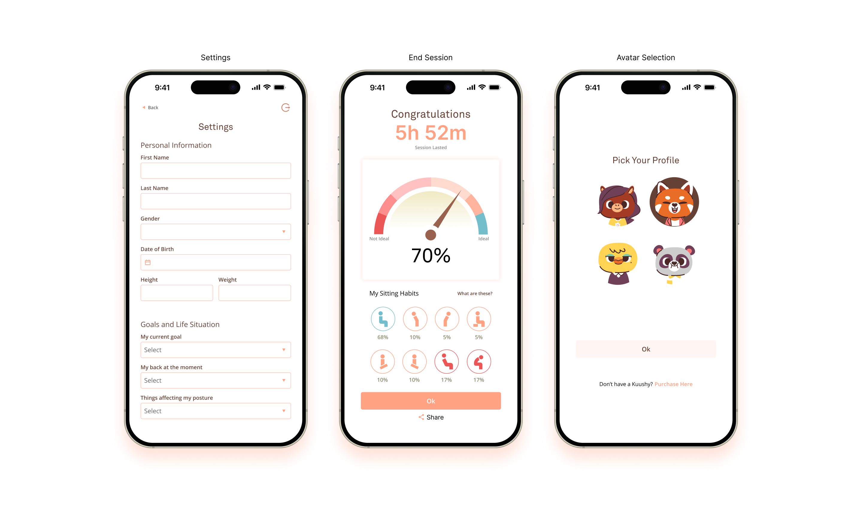
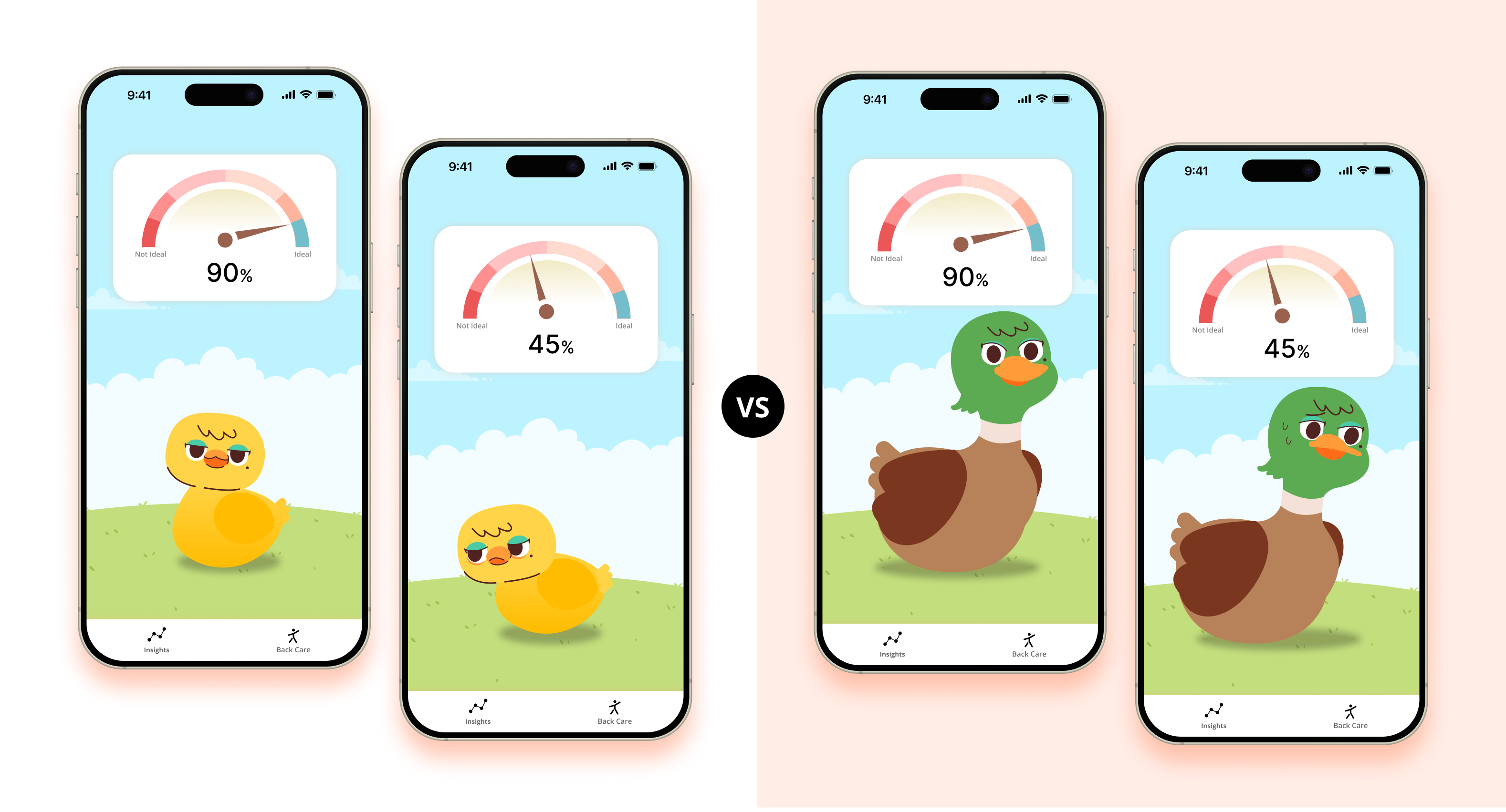
The first rendition was more exploratory; the final version was heavily simplified to match the leaner, orange-led brand direction the client ultimately approved.

The Results
Impact
No post-launch metrics were shared by the client after the engagement closed, and Webpuppies had no visibility into product performance following handoff, so outcome here is described through delivery and process discipline rather than measured impact. The engagement ended with a locked, buildable design direction and a working exercise animation library, despite starting with no finalized branding and a brief that changed shape multiple times mid-project.
Key Results

When the CEO asked for an exercise-trigger feature partway through the project, it was translated into a specific UX proposal: a flow that would detect recurring posture mistakes and automatically surface a matching corrective exercise, using a “next move” pattern common to exercise apps. The client rejected the personalized, mistake-type-specific version and the next-move UI, but a simplified version of the exercise trigger flow was still incorporated into the final product journey.
The client’s decision to move from a blue-leaning palette to orange came after component patterns were already established. Because those patterns were built as platform-agnostic design system elements rather than one-off screens, the color change could be applied without reworking the underlying structure.
Before designing the posture-feedback visualization, the cushion’s technical specifications were requested from the client. This kept the sensor visualization tied to how the hardware actually detected and reported posture data, rather than to an assumed or generic representation.
Features
Onboarding & Calibration Flow
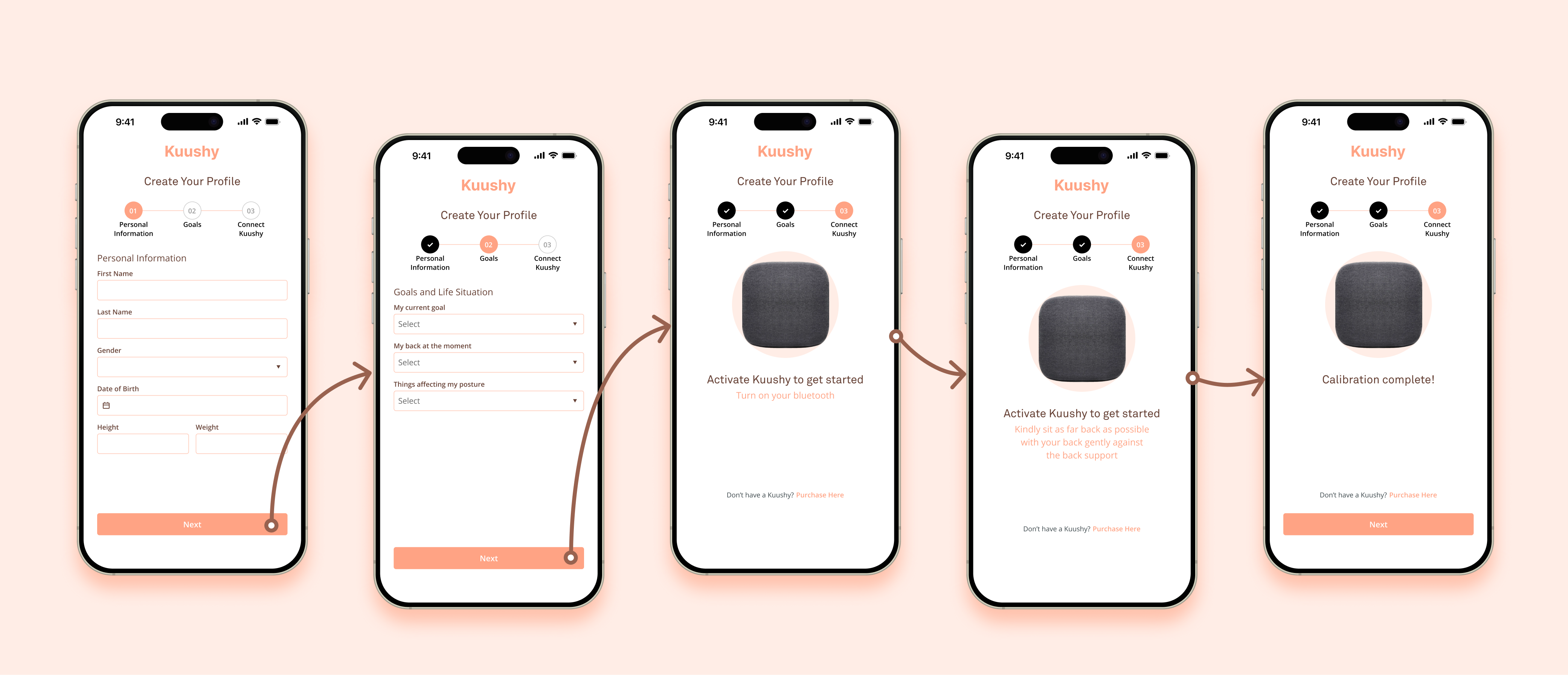
Walks first-time users through pairing and calibrating the cushion before use. Sequenced last in the design process so it could be built against the final approved brand and real product photography instead of placeholders, avoiding a rework cycle when the brand direction changed.
Avatar Growth Mechanic (Chick to Duck)
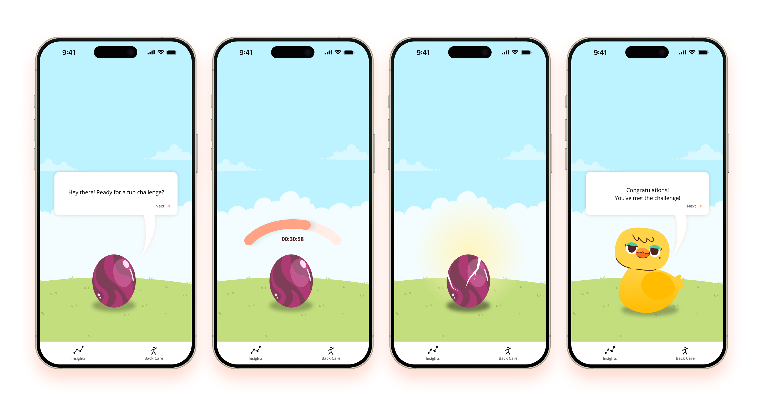
Gives users a visible, ongoing signal of consistent posture behavior. On first visit to the companion screen, a walkthrough asks the user to demonstrate at least one cumulative hour of good posture; completing it hatches an egg into the chick mascot. A full grown-duck stage was designed and explored, but the client chose to keep the chick as the shipped version to simplify development scope for the MVP.
Animated Exercise Library
Chiropractor-demonstrated corrective exercises, provided by the client, were translated into an in-app animated library so users have clear visual guidance for movement without needing a live instructor present.
The following are 4(out of 6) of the videos submitted to the client. All were made using Illustrator and After Effects.