CRO Strategy and Shopify Development for Veii Apparel
Contract Duration
Summer to Fall 2024
Industry
Output Type
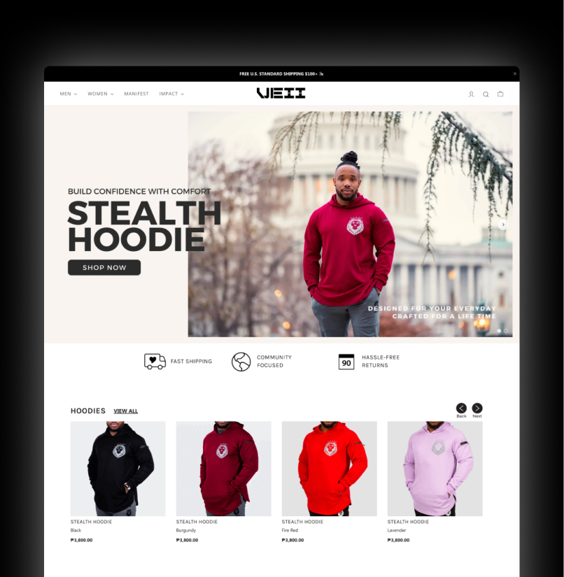
A CRO strategy and Shopify front-end development using Microsoft Clarity's behavioral data to fix friction points. Later on launching a loyalty system program despite the structural challenge of selling cold-weather gear during a summer traffic window.

Deliverables

Product Page Redesign
Collection Dropdown Navigation
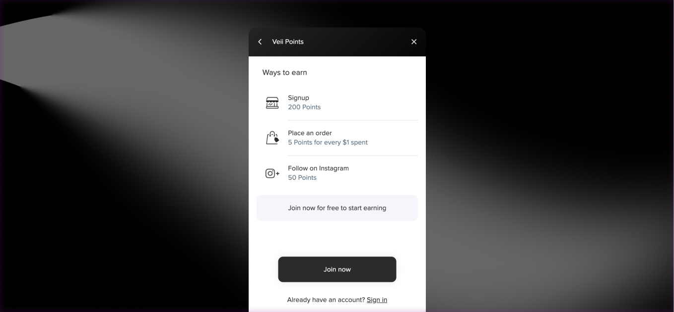
Reward and Loyalty System
Campaign Landing Page


Context
Veii Apparel is a community-driven activewear brand selling performance hoodies, sweatshirts, and joggers through their own Shopify store. Around mid-2024, I was hired to be their CRO Strategist and Shopify Front-End Developer. The goal was to optimize the store's conversion rates and enhance the overall user experience. I mostly used Microsoft Clarity to get Veii's customer behavioral data.
The project spanned approximately three to four months, starting in the summer, which posed unique challenges given the seasonal nature of their cold-weather product catalog.
Team
Just Me
Roles
CRO Strategist
Shopify Developer
UX/UI Designer
Skills
UX Research
A/B Testing
Prototyping & Wireframing
Data Gathering & Analysis
Presentation Design
Tools


Research & Discovery
Microsoft Clarity was the sole research tool used throughout the project, installed by the founder before the engagement began. Session recordings and heatmap data surfaced three consistent behavioral patterns that shaped the prioritization of work:

The majority of visitors were leaving between the 50 and 75 percent scroll depth, suggesting friction or a loss of intent before reaching the CTA.
Concentrated rage-click activity pointed to user frustration, most likely caused by sizing information being unavailable at the moment users needed it to commit to a purchase.
No formal user interviews or surveys were conducted. All design decisions were grounded in Clarity's behavioral data.
Key Insights

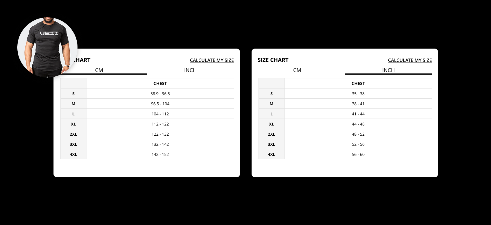
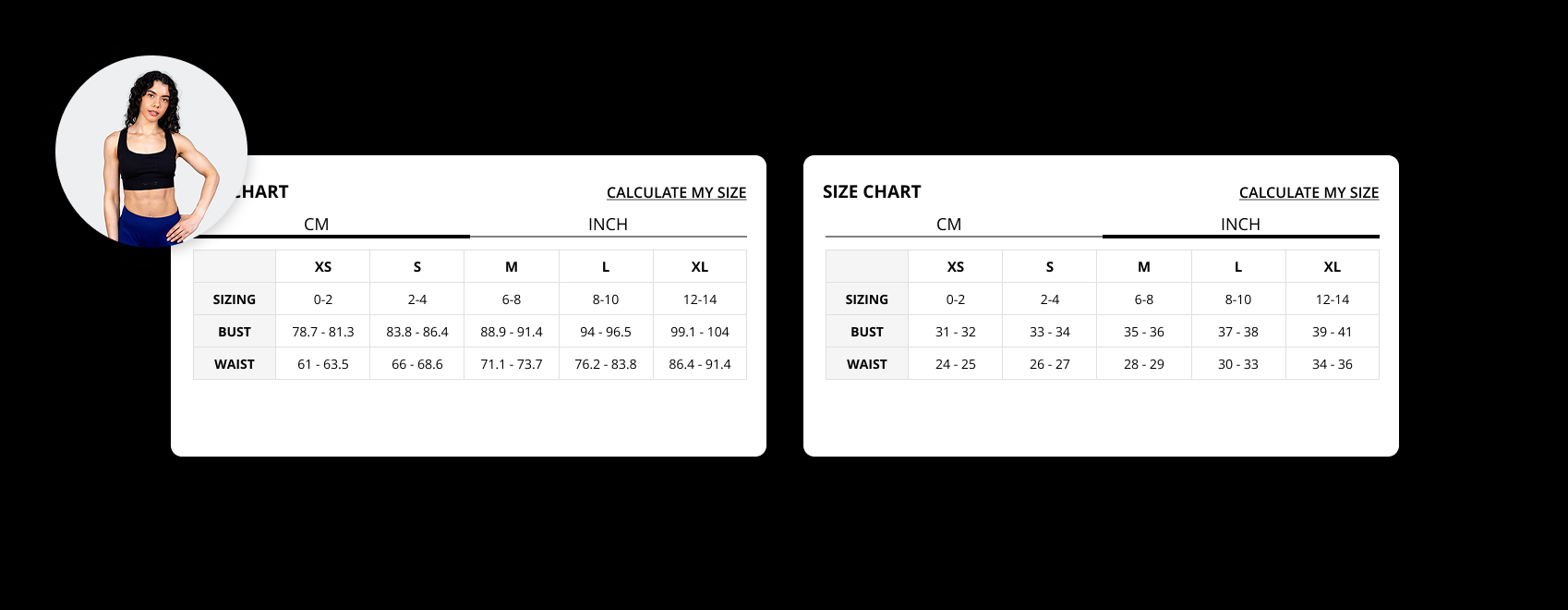
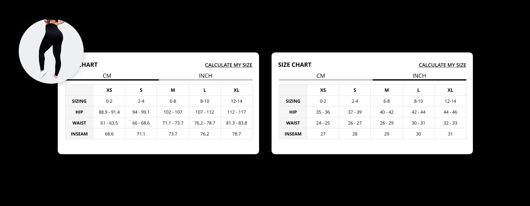
Bringing out the size chart outside to the open, lessen the friction for visitors to find the sizing information; which is a critical factor for purchase decision.
Design Iterations
Each change followed a staging-first workflow: build in staging, review and approve with the founder, document the change, push live, then measure over a two-week window before prioritising the next initiative. This made the process methodical even when the contract was short and the measurement windows were limited.
The scope of the engagement expanded mid-contract when the founder realised the role included front-end Shopify development capability. The original brief was behavioral data analysis and friction-point fixes. By the end, the work also included a loyalty system and a campaign landing page, both of which went beyond the original CRO mandate.

The Results
Impact
Five initiatives were scoped, built, and measured across the engagement. Each enhancement was tracked over a two-week window.
UI Enhancement Outcome

Clarity data showed the size chart was buried below the fold, meaning users arrived at the add-to-cart point without having resolved their primary sizing question. Bringing the chart forward and adding a CTA banner to catalogue page templates produced a combined 0.3 percentage point lift in conversion rate across the two-week measurement window.
A loyalty system was collaboratively scoped to target repeat purchase behavior rather than new visitor acquisition. Under summer conditions with a cold-weather catalog, retention had more room to move than acquisition. The result was the highest-impact outcome of the project: approximately 1 percentage point CR increase and a 10% revenue lift within the measurement window.
The desktop navigation update and catalogue dropdown were both shipped but produced no measurable change in conversion rate. TikTok-referred traffic typically lands directly on product pages rather than navigating from the top of the site, which likely limited the reach of these changes. The desktop navigation update reflected stakeholder preference rather than a behavioral data signal.
Features
Size Chart Prominence
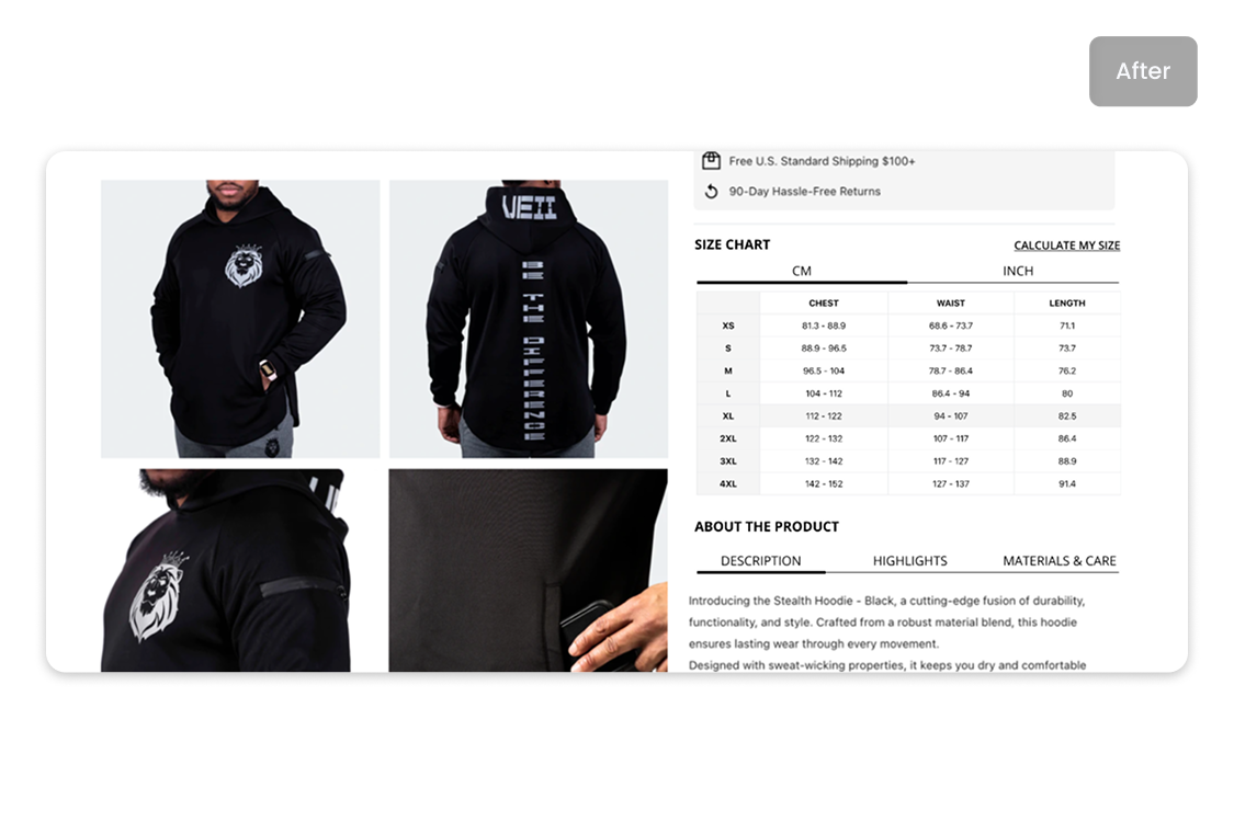
Moved the size chart above the fold on the product page template so visitors could resolve sizing questions before reaching the CTA. Addressed the rage-click and drop-off pattern concentrated on product pages in Clarity's data.
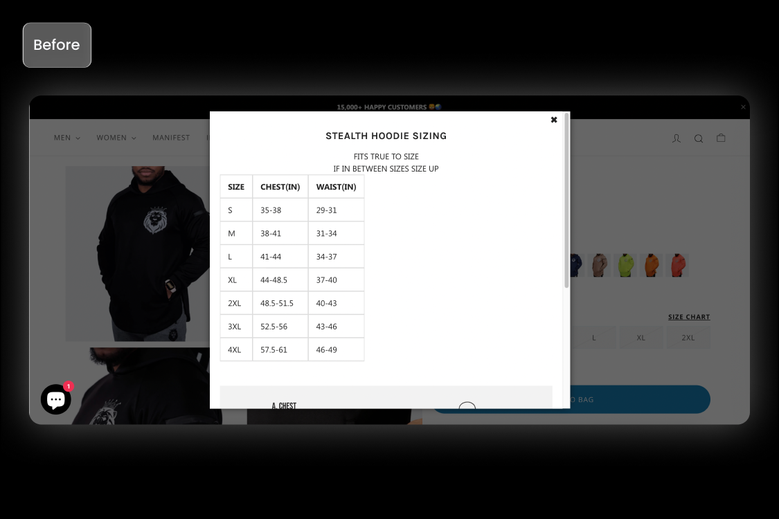
Before
The size chart was behind a widget.
After
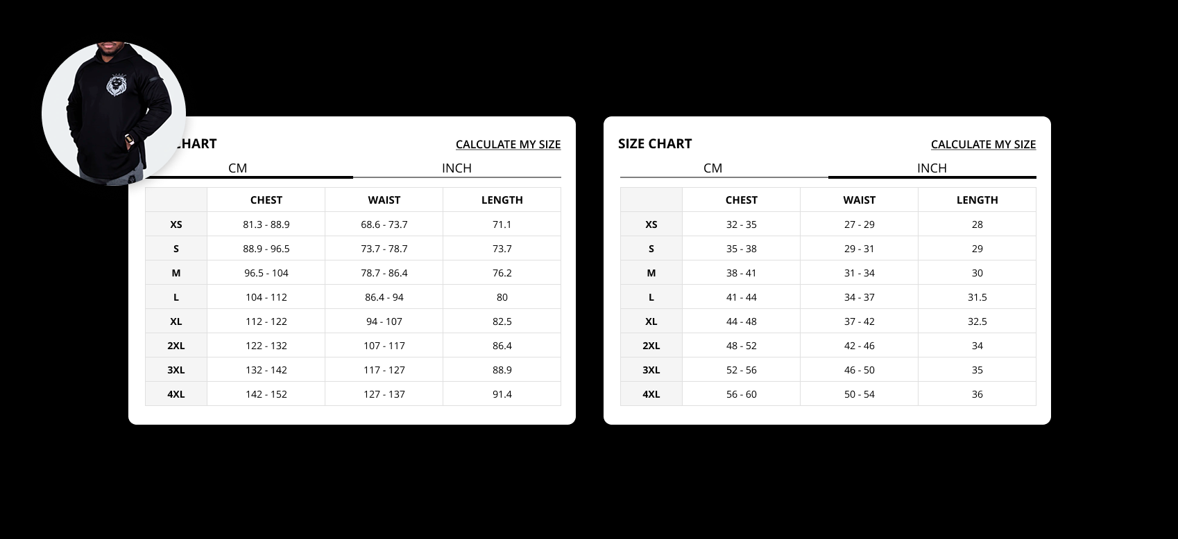
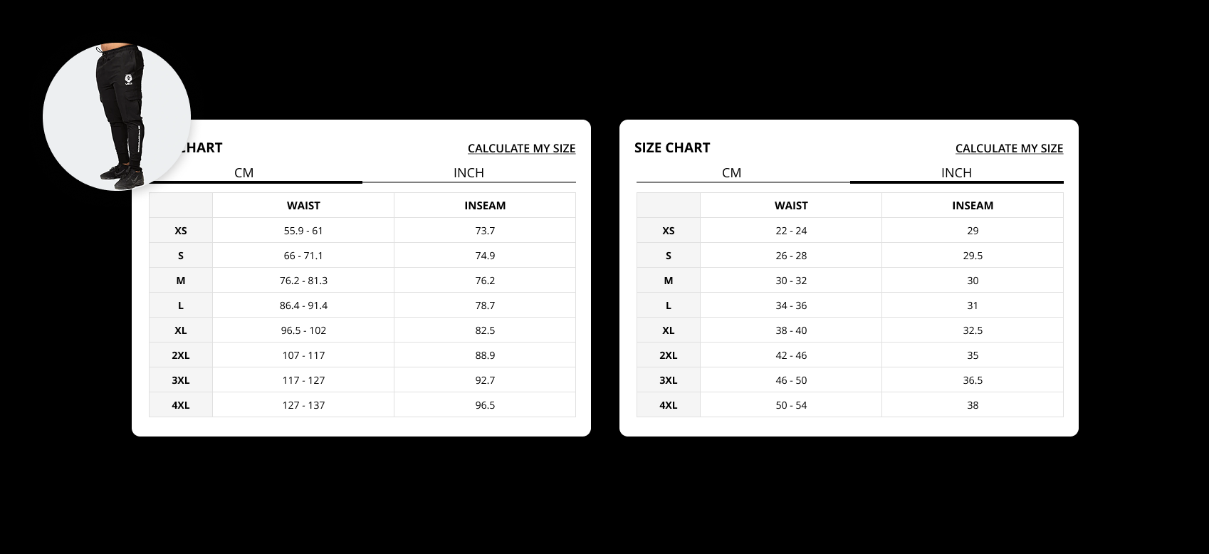
I disabled the widget and manually coded the size chart close to the CTA button.
CTA Banner on Catalogue Pages
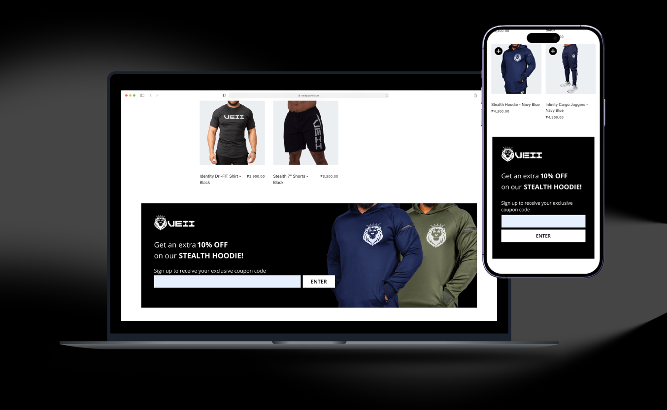
Added a call-to-action banner to catalogue page templates to create an additional persuation for users to purchase. Responded to Clarity finding of low exploration depth across the catalogue.
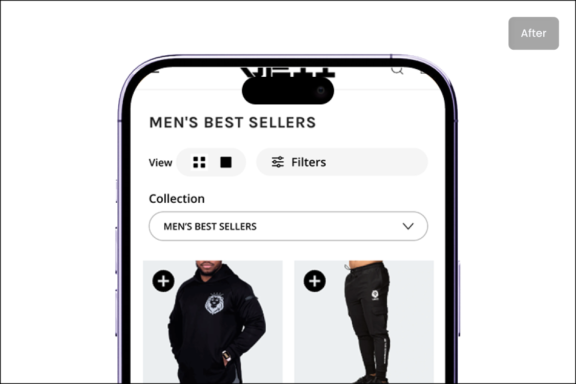
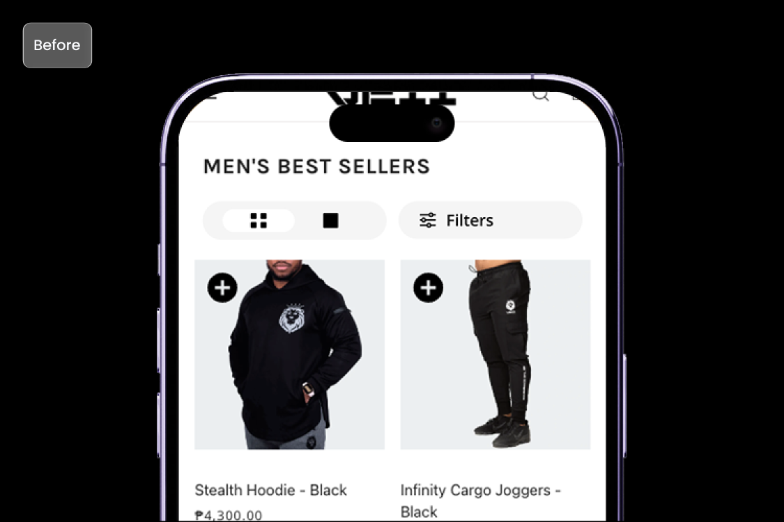
Collection Dropdown Navigation
Surfaced collection categories as a dropdown on catalogue pages to reduce the clicks. This is so that a visitor doesn't always have to click through the menu over and over again. Intended to shorten the path between browsing behavior and product page arrival.
Before
User had to click multiple times within the navigation to explore each catalogue page.
After
User can simply select within a dropdown; not needing to leave the current page.
Reward and Loyalty System
Built and launched an on-site reward system designed to incentivise repeat purchases from existing buyers. Collaboratively scoped with the founder as a retention strategy, not an acquisition one.